filmov
tv
Windows Icon Evolution: My Computer

Показать описание
Here is another video showing how the Windows 'Computer' icon has evolved since Windows 95. Note that beta builds are not included in this video.
Song: Rival x Asketa & Natan Chaim - Superhero In My Sleep [NCS10 Release]
Music provided by NoCopyrightSounds
SOCIAL MEDIA LINKS:
Song: Rival x Asketa & Natan Chaim - Superhero In My Sleep [NCS10 Release]
Music provided by NoCopyrightSounds
SOCIAL MEDIA LINKS:
 0:01:44
Windows Icon Evolution: My Computer
 0:01:05
My Computer Icon Evolution | Evolution of Windows Icons | Factonian
 0:01:52
Windows Icon Evolution: My computer
 0:02:38
Windows Icon Evolution: My Documents
 0:03:06
Windows Icon Evolution: File Explorer
 0:02:40
Windows Icon Evolution: Internet Explorer
 0:01:59
Windows Icon Evolution: PowerPoint
 0:01:44
Windows Icon Evolution- My Computer
 0:00:12
Evolution of Windows Update icons 1996-2023
 0:03:07
Windows Icon Evolution: Control Panel
 0:01:59
Windows Icon Evolution: System Drive
 0:01:58
Microsoft Office Icons Evolution!
 0:01:42
Russia Man's Windows Icon Evolution Series - Installer - Episode 31
 0:02:19
Windows Network Icon Evolution (1993 - 2022)!
 0:00:25
Evolution of My Computer icons 1993-2022
 0:00:19
The Evolution of the 'My Computer' Icon: From Windows 95 to Windows 11
 0:03:13
Windows Control Panel Evolution
 0:01:28
Windows Notepad Icon Evolution (1985 - 2020)!
 0:00:18
Evolution of Windows Hardware Sounds! - (2001 - 2021)
 0:02:38
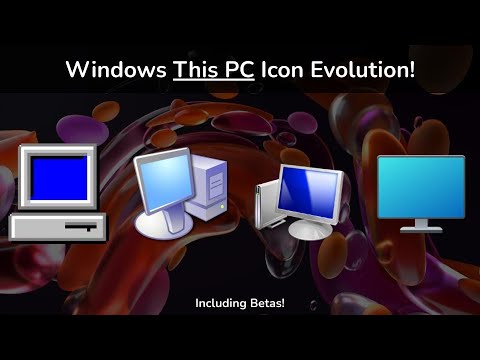
Windows This PC Icon Evolution (Windows 95 - Windows 11) + Betas!
 0:02:40
Windows Icon Evolution: Microsoft Store
 0:00:32
Evolution of Computer from 1990 to 2020 #shorts/#evolution/#computer
 0:00:11
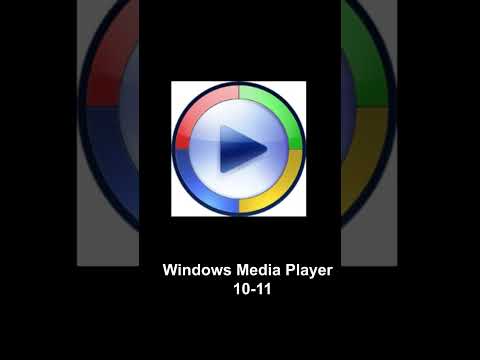
Evolution of Windows Media Player icons 1991-2023
 0:01:45
Windows Icon Evolution: Folder Icon
Комментарии