filmov
tv
16 FAMOUS LOGOS WITH A HIDDEN MEANING|THAT WE NEVER KNEW|BRIGHTOLOGY

Показать описание
How to design a successful logo? How to build a famous brand for your business? Some of the most well-known logos in the world were purposefully designed to indicate something much more than simple beauty. In fact, it seems that in some cases, every line, curve, and color has meaning behind it.
Adidas, Apple, BMW, Coca-Cola, Toyota… We see these famous brands everywhere but never consider what their logos exactly mean. Curious to know the secret? Watch the 16 famous logos with a hidden meaning you've never noticed.
Copyright Disclaimer Under Section 107 of the Copyright Act 1976, allowance is made for 'fair use' for purposes such as criticism, comment, news reporting, teaching, scholarship, and research. Fair use is a use permitted by copyright statute that might otherwise be infringing. Non-profit, educational or personal use tips the balance in favor of fair.
16.Hyundai
The letter ’?’ symbolizes two people – a client and a representative of the company – shaking hands.
15.Adidas
The current logo is three stripes at an angle which together form a triangle. This symbolizes a mountain, which in turn represents the challenges that all sportsmen have to overcome day after day.
14.Apple
Rob Janoff, the designer who came up with the world-famous Apple company logo, explained his idea in one of his interviews. He bought a bag of apples, placed them in a bowl, and spent time drawing them for a week, trying to break the image down into something simple.
13.Vaio
The first two letters of the Vaio logo symbolize an analogue wave. The last two are similar to the numbers 1 and 0 — that is, symbols of a digital signal.
12.Amazon
The orange arrow is similar to a smile because the company wants its customers to be satisfied. The arrow is also stretched between the letters ’A’ and ’Z’, in a hint that the company sells absolutely every product you can imagine.
11.Baskin Robbins
The pink-colored parts of the "BR" section make up the number 31, which is how many ice cream flavors Baskin Robbins used to famously sell.
10.Toyota
The logo represents a stylized image of a needle eye with a thread passing through it. This is a hint at the company’s past – they used to produce weaving machines.
9.Continental
Continental, a famous car tire producer, has a logo in which the first two letters depict a car wheel.
8.Formula 1
If you look carefully at the white space between the letter ’F’ and the red stripes, you can see the number 1.
7.Pinterest
On Pinterest, people collect images they like from across the Internet and ’pin’ them to their online boards. That’s why the image of a pin is hidden in the letter P.
6.Beats
Beats, an audio equipment producer based in the USA, uses a logo in which the letter ’B’ looks like headphones on a person’s head.
5.Toblerone
The famous chocolate company based in Bern, Switzerland, has a silhouette of a bear in its logo. That's because Bern is sometimes called a city of bears.
4.BMW
The logo is simply a part of the Bavarian flag, the area of Germany where the company originated.
3.LG
The logo is a stylized image of a person’s face. According to the company, this represents its aspiration to have human relations with their customers.
2.Evernote
The corner of the elephant’s ear is folded over in a similar way how people fold the corner of a page to make notes.
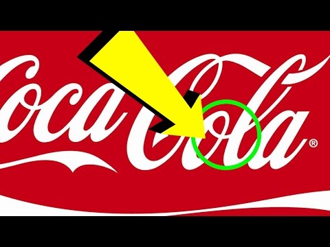
1.Coca-Cola
In the space between the letters ’O’ and ’L’, you can see the Danish flag. It’s purely a coincidence. Nevertheless, Coca-Cola has used this as part of its marketing campaigns in the Scandinavian country.
If you’ve enjoyed this video, like this video!
#logomeaning #logosecret #
Adidas, Apple, BMW, Coca-Cola, Toyota… We see these famous brands everywhere but never consider what their logos exactly mean. Curious to know the secret? Watch the 16 famous logos with a hidden meaning you've never noticed.
Copyright Disclaimer Under Section 107 of the Copyright Act 1976, allowance is made for 'fair use' for purposes such as criticism, comment, news reporting, teaching, scholarship, and research. Fair use is a use permitted by copyright statute that might otherwise be infringing. Non-profit, educational or personal use tips the balance in favor of fair.
16.Hyundai
The letter ’?’ symbolizes two people – a client and a representative of the company – shaking hands.
15.Adidas
The current logo is three stripes at an angle which together form a triangle. This symbolizes a mountain, which in turn represents the challenges that all sportsmen have to overcome day after day.
14.Apple
Rob Janoff, the designer who came up with the world-famous Apple company logo, explained his idea in one of his interviews. He bought a bag of apples, placed them in a bowl, and spent time drawing them for a week, trying to break the image down into something simple.
13.Vaio
The first two letters of the Vaio logo symbolize an analogue wave. The last two are similar to the numbers 1 and 0 — that is, symbols of a digital signal.
12.Amazon
The orange arrow is similar to a smile because the company wants its customers to be satisfied. The arrow is also stretched between the letters ’A’ and ’Z’, in a hint that the company sells absolutely every product you can imagine.
11.Baskin Robbins
The pink-colored parts of the "BR" section make up the number 31, which is how many ice cream flavors Baskin Robbins used to famously sell.
10.Toyota
The logo represents a stylized image of a needle eye with a thread passing through it. This is a hint at the company’s past – they used to produce weaving machines.
9.Continental
Continental, a famous car tire producer, has a logo in which the first two letters depict a car wheel.
8.Formula 1
If you look carefully at the white space between the letter ’F’ and the red stripes, you can see the number 1.
7.Pinterest
On Pinterest, people collect images they like from across the Internet and ’pin’ them to their online boards. That’s why the image of a pin is hidden in the letter P.
6.Beats
Beats, an audio equipment producer based in the USA, uses a logo in which the letter ’B’ looks like headphones on a person’s head.
5.Toblerone
The famous chocolate company based in Bern, Switzerland, has a silhouette of a bear in its logo. That's because Bern is sometimes called a city of bears.
4.BMW
The logo is simply a part of the Bavarian flag, the area of Germany where the company originated.
3.LG
The logo is a stylized image of a person’s face. According to the company, this represents its aspiration to have human relations with their customers.
2.Evernote
The corner of the elephant’s ear is folded over in a similar way how people fold the corner of a page to make notes.
1.Coca-Cola
In the space between the letters ’O’ and ’L’, you can see the Danish flag. It’s purely a coincidence. Nevertheless, Coca-Cola has used this as part of its marketing campaigns in the Scandinavian country.
If you’ve enjoyed this video, like this video!
#logomeaning #logosecret #
 0:06:33
 0:10:16
 0:14:50
 0:26:12
 0:05:56
 0:06:29
 0:00:57
 0:09:14
 0:00:14
 0:11:10
 0:06:35
 0:06:59
 0:05:18
 0:06:01
 0:30:44
 0:08:42
 0:00:23
 0:00:35
 0:06:24
 0:09:26
 0:12:33
 0:05:37
 0:00:14
 0:11:14