How The New Overground Colours Were Designed ( 2024 Tube Map )

preview_player
Показать описание
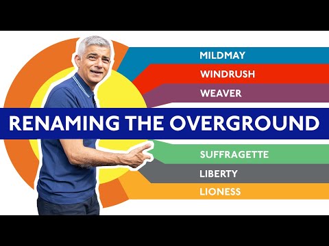
The London Overground lines on the New 2024 Tube Map have been given six new names and six new colours. I caught up with Jon Hunter - Head of Design at TfL - for a deep dive interview to talk about the names and colours of the design process, and all things Tube Map design ...

Additional Camera - Dan Haythorn

Further Reading:
Рекомендации по теме
Комментарии
Автор

geoff your interview technique has come on leaps and bounds over the last few years. well done, excellent piece

felixjohnson
Автор

“We had to visualise how the line names would be used in daily life”

Maybe didn’t visualise enough: “Yeah I’m riding the Suffragette!”

Nick-kzdg
Автор

I just love how Geoff keeps connecting with people who are so instrumental to everything surrounding TfL, but who maybe never realised how much their daily business is fascinating to tens of thousands of people! Thanks for spotlighting this brilliant designer, Geoff!

Eddyspeeder
Автор

Geoff nerding out on design for 20 minutes. I'm all here for it.

mrtnsnp
Автор

Fascinating to learn just how much effort goes into it. TfL takes design VERY seriously - and quite rightly

robertward
Автор

I've really enjoyed your slightly longer recent videos. Thank you for them. More of these longer form interviews please with people who have something interesting to say. They're fascinating.

LuxFlyer
Автор

Outstanding Geoff. As a cartographer, I fully appreciate the effort needed to achieve this along with the other wider tfl map complexities.

garrygreen
Автор

11:43 “that’s why we’re not going to have a Mildmay roundel”… agree, which is exactly why Crossrail should’ve been kept for roundels and the system name, with Elizabeth line being the line name. The current setup makes no sense!

ElshadKarbasi
Автор

Excellent detailed video. Brilliant explanations for everything going on. As a graphic designer by trade (a long time ago) They've done well in trying not to have much colour clash on a map that is beginning to look like playschool plasticine worms! There'll always be some controversy about line naming which will probably ruffle feathers on those with right-leaning sentiments. Good job by TfL and your presentation on the subject. 👍

DanLoudShirts
Автор

Finally more background behind the change.

life.with.sabine
Автор

The trams were originally different colours when it launched in 2000
Yellow was Wimbledon to Elmers End
Red was Beckenham Junction to West Croydon
Green was New Addington to West Croydon
The separate coulors disappeared around 2008 when the routes were restructured & TFL took over the running of the service.

jameswatt
Автор

Love these behind the scenes Videos great insights. Greetings from Germany

florianb
Автор

Great to hear this Geoff. The detail on how they choose line colours is very welcome.

However, the current design of TfL's actual lines almost seems intended to cause confusion. It is a real missed opportunity that TfL continue to only have 3 (meaningful) categories of line:
- solid: underground. Good. Everyone can understand this.
- cased with occasional solid bits: mainline rail service not run by TfL. Oddly specific but at least this is clear.
- cased: literally every other sort of rail transport in the capital. What a mess.

If the pretence that this is a successor to the Beck Tube Map is to be continued, it needs to clearly:
- show that the DLR & trams are a similar level of service
- show that the Overground is it's own type of service
- show that Elizabeth Line/Crossrail is a distinct type of service (perhaps also show Thameslink in the same style as it's a similar level of service, at least within zones 1-2).

TfL need to look seriously at how Paris do this - thicker lines for bigger trains.
If they aren't prepared to do this, then at least make the Elizabeth Line distinct from the Overground/DLR/Trams.

The (very helpful) publicity describing CrossElizPurpRail as a new type of service for London is totally undermined by the branding.

peeky
Автор

‘Which one would you keep orange?’

The Windrush (former East London) line seems like the obvious choice.

edbrown
Автор

Re. white as a line colour: this was actually done years ago, when the Underground map only featured a couple of British Rail lines. The North London Line, which was more or less treated as an honourary tube line at the time, was shown in white, but outlined with a thin black line, so you could actually see it. I always thought the trick worked surprisingly well. And talking of how the colours work under different types of lighting - is it me, or is the circulating area at the top of the stairs at Edgware Road lit very oddly, with a weird greenish light? I've got good colour vision, but to me the tube map colours look very strange under that lighting.

heavyspanners
Автор

I’m all set with the new names and colours, except the lack of orange and the missed opportunity for Goblin.

mst
Автор

I still can't forgive them for not adopting goblin

oldtechnobodycaresabout
Автор

Such a cool video Geoff. I absolutely love the new names, it’s great that there’s a lot of our history behind those names. As a designer, the interview and deep dive into the design process was really fascinating.

BooksandArmchair
Автор

I need to know about the triangle map!!!

Genuinely fascinating insight. Thank you.

simonbrodie
Автор

Cracking video Geoff. Detailed explanations, excellent questions and people who care about what they do. Thanks for your consistently high-quality content.

jonathanirons
welcome to shbcf.ru