filmov
tv
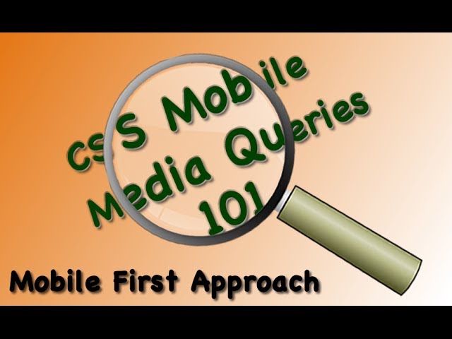
Overview and Demo CSS Media Query Mobile First Responsive Design
Показать описание
Audience: Those who are new to CSS Cascading Style Sheets for mobile development.
This is first video in a series to build a framework for CSS Cascading Style Sheets following the mobile first responsive design approach. This video shows the testing demonstrated using Firefox responsive design tools.
Mobile first designs target all mobile device by using screen widths. You start out with a base screen Cascading Style Sheet.
Then using progressive media queries to detect wider and wider device screen widths, overrides to Cascading Style Sheets are applied.
At then end of the series you have a template to target smartphones, mobile tables like the iPad, and laptops and desktops.
Designing for mobile first is very easy if you have a single column of text and add the CSS img {height: auto; width: 100%; } to make the images flexible. But ultimately you design multiple column layouts and graphics that may not be suitable for dynamic resizing across the wide width spectrum of viewing screens that your visitor may be using.
 0:09:44
Master Media Queries And Responsive CSS Web Design Like a Chameleon!
 0:07:50
Overview and Demo CSS Media Query Mobile First Responsive Design
 1:26:14
Learn CSS Media Queries by Building 3 Projects - Full Course
 0:07:23
Intro to CSS Media Queries | Jared Youtsey | EnterpriseNG 2020 #ngconf
 0:09:50
Learn CSS Media Queries in 9 Minutes
 0:08:18
How To Make Website Responsive Using CSS Media Queries | Responsive Web Design Tutorial
 0:01:44
CSS Flexbox in 100 Seconds
 0:13:44
How to write media queries in CSS
 0:01:53
CSS media queries not being triggered at defined width
 0:05:10
Looking At How Browser Zoom Affects CSS Media Queries And Pixel-Density
 0:04:33
Quick Tip: A Crash-Course in CSS Media Queries
 0:00:32
CSS Level 3 Media Query Demo
 0:18:19
CSS Media Properties Explained | Media Types in CSS | CSS for Beginners | SimpliCode
 0:08:00
CSS Media Queries Tutorial
 4:14:08
Introduction To Responsive Web Design - HTML & CSS Tutorial
 0:07:51
CSS Media Queries in Dreamweaver Demo
 0:01:49
Electron JS in 100 Seconds
 0:00:58
CSS :focus-visible #css
 0:45:14
PB101: L11 - Responsive Development With Breakpoints & Media Queries (+ CSS Cascade & Specif...
 0:14:50
RWD 05 - Building the CSS Media Queries - Part 03
 0:19:31
How To Use Custom Responsive CSS Media Queries In Divi
 0:35:44
Introduction to CSS Container Queries | FREE COURSE
 0:56:36
25 | LET'S MAKE OUR WEBSITE RESPONSIVE | 2023 | Learn HTML and CSS Full Course for Beginners
 0:05:05
SEO In 5 Minutes | What Is SEO And How Does It Work | SEO Explained | SEO Tutorial | Simplilearn
Комментарии