filmov
tv
New UI Walkthrough [10.0 Dragonflight]

Показать описание
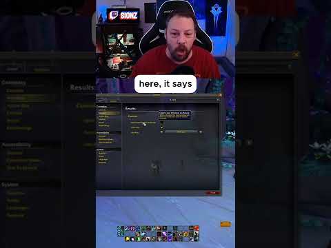
Dragonflight comes out in less than a month! Patch 10.0 brought a huge redesign to the default UI, and we’ve really been enjoying how much better it is!
Llarold has made some big changes to his UI setup, and he has a walkthrough of all the important addons you should use, and profiles to import them!
Chapters:
0:00 Intro
1:33 Default UI
4:00 ElvUI
5:22 Unit Frames
9:15 Action Bars
12:02 Weakauras
13:32 Nameplates
18:29 Cast Bars
19:47 Boss Mods
23:48 Tooltip
24:25 Damage Meters
27:48 Inventory
28:56 Map
32:20 Questing
33:11 Quality of Life Addons
40:31 Outro
♫Music♫
©2022 Blizzard Entertainment, Inc. All rights reserved. World of Warcraft: Dragonflight is a trademark, and World of Warcraft, Warcraft and Blizzard Entertainment are trademarks or registered trademarks of Blizzard Entertainment, Inc. in the U.S. and/or other countries.
New UI Walkthrough [10.0 Dragonflight]
Dragonflight's Best Settings & UI Layout with ZERO ADDONS
NEW Dragonflight UI Set Up Guide | 10.0 Dragonflight Pre-Patch WoW UI
Dragonflight UI Guide: ALL You Need to KNOW!
How to Use the NEW UI in World Of Warcraft dragonflight guide
Dragonflight Edit Mode - Is it the end of UI Addons?!
15 Ways To Improve The New UI
Creating my Dragonflight UI with the NEW Blizzard UI | Dragonflight Beta
EVERYTHING To Do At Max Level in The War Within & What To Do First
How to Change your Loot Window in the New Warcraft UI
This UI is SO CLEAN! | Complete UI Overhaul for The War Within
Will Dragonflight's New UI Replace Addons?
DRAGONFLIGHT Clean UI UPDATED - Minimalistic & Dark UI
The War Within's BEST Graphic Settings & UI Layout (NO WeakAuras)
Which type of WoW walker are you?
How To Gear Up ILVL 515 ALL BY YOURSELF - No Difficult Content Needed!
QUICK Mistweaver 1 Minute GUIDE for M+ ~ Season 3 Dragonflight Mistweaver Monk (Bite-Sized Guide)
This Tank UI Takes Your Gameplay To THE NEXT LEVEL
Healer UI & Addon Guide for Dragonflight Season 4
5 MIN Guide To 10.2.5 Blood Death Knight GOD
The COMPLETE Beginners Guide to Mythic+ in 2023
Addressing A Common Dragonflight UI Problem - Quick Tutorial
Dragonflight UI Tips and Tricks from my set up
Why I left Blizzard Entertainment
Комментарии
 0:41:07
 0:05:59
 0:20:53
 0:10:54
 0:05:56
 0:00:59
 0:05:23
 0:11:22
 0:14:39
 0:00:39
 0:14:16
 0:10:50
 0:14:00
 0:12:37
 0:00:15
 0:15:27
 0:01:15
 0:22:44
 0:17:50
 0:04:54
 0:18:15
 0:04:30
 0:11:52
 0:00:56