filmov
tv
Sources of Methane

Показать описание
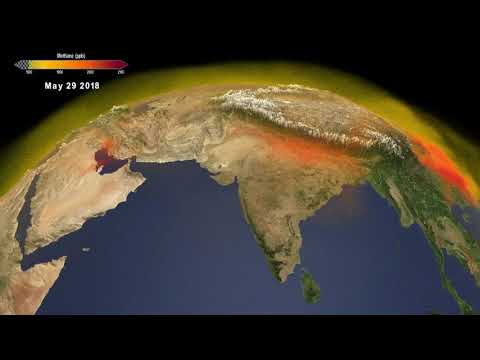
The visualization presented here shows the complex patterns of methane emissions produced globally between January 2018 and November 2018 from different sources.
Methane is a powerful greenhouse gas that traps heat 28 times more effectively than carbon dioxide over a 100-year timescale. Concentrations of methane have increased by more than 150% since industrial activities and intensive agriculture began. After carbon dioxide, methane was responsible for about 23% of climate change in the 20th century.
Methane is produced under conditions where little to no oxygen is available. About 30% of methane emissions are produced by wetlands, including ponds, lakes, and rivers. Another 20% is produced by agriculture, due to a combination of livestock, waste management and rice cultivation. Activities related to oil, gas, and coal extraction release an additional 30%.
Credit: NASA's Scientific Visualization Studio
Music: "Motion Blur" by Sam Dobson [PRS]
Sources of Methane
Sources of Methane Gas emissions and its affects.
NASA Models Methane Sources and Movement Around the Globe
What is methane? And what part does livestock farming play?
Sources of methane
Methane’s life, death, and secret second life
Everything you Wanted to Know About Atmospheric Methane Sources and Sinks and Forcings
What is Methane?
Sources of Methane
Science Action: What's the unique role of methane in climate change?
What are the sources of methane emissions?
The methane cycle
Identifying Sources of Methane Leaks in the Bountiful North Salt Lake Area
CH4 | Methane | Sources and Impacts| OIZOM Academy
Top 10 Methane Hotspots Revealed by Satellites!
upsc cse pre 2008 Source of methane
What's the deal with methane?
Methane Emissions in the United States
Methane Rise Caused By Biological Sources
Third largest source of methane emissions worldwide, after oil and gas systems and agriculture
Science Snippets: Responding to Persistent Methane Sources
Methane Introduction - In this series of videos we take a look at greenhouse gases.
Chapter 4 - Methane Sources by Oil and Gas Market Segment
Give three sources of methane.
Комментарии
 0:01:59
 0:01:39
 0:02:19
 0:03:31
 0:00:13
 0:10:14
 0:15:00
 0:03:39
 0:01:59
 0:04:22
 0:00:22
 0:08:45
 0:17:37
 0:02:58
 0:01:02
 0:01:00
 0:02:01
 0:00:36
 0:02:29
 0:00:13
 0:07:44
 0:00:59
 0:29:42
 0:00:33