filmov
tv
Wicked director defends film's color

Показать описание
Wicked's director is now defending the movie’s color grading (Sources: The Globe and Mail, Deadline, Variety, RottenTomatoes) #wicked #jonmchu #movies #wickedmovie #cinematography
Welcome to Pop Culture Brain, bringing you the movie news, TV news, and what-to-watch recommendations you need to know. We’ve got you covered with fun and informative pop culture updates and reflections.
Pop Culture Brain has been highlighting and curating the best and most important entertainment news for over a decade. It was named one of TIME’s Top 30 must-see Tumblr blogs and BuzzFeed’s Top 90 Tumblr blogs, and received a Lifetime Achievement Award from Tumblr itself.
 0:00:24
Wicked | Madame Morrible and Glinda Defending Elphaba | Deleted Scene
 0:05:25
Cynthia Erivo | Defying gravity (From wicked) ft. Ariana Grande | Music video
 0:01:38
Cynthia Erivo Slams Fan-Edited 'Wicked' Poster: 'It Degrades Me'
 0:00:22
Best Line From Better Call Saul
 0:00:59
BBFC issues trigger warning for 'Wicked' over discrimination themes
 0:04:26
Idina Menzel - Defying Gravity (from LIVE: Barefoot at the Symphony)
 0:01:48
Oscars 2025: Host Conan O'Brien gives Adam Sandler a hard time over his choice of outfit
 0:00:15
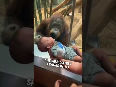
This orangutan wanted to see their baby ❤️
 0:00:28
Judge Judy on what she thinks about Donald Trump
 0:00:26
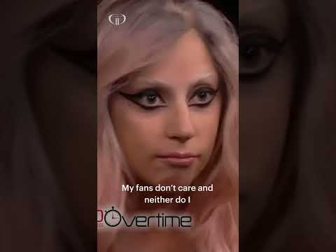
Lady Gaga’s best response ever
 0:07:40
Defying Gravity
 0:00:13
{MUFASA} Defending my brother with all my Colors 💜💙💚🤎 #mufasa #lionking #shorts
 0:00:19
Jim Carrey's Grinch Face is the REAL DEAL!
 0:03:15
Lip Reader Calls Out Ryan Reynolds' Moody Comment To Blake Lively
 0:01:01
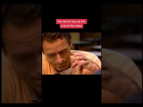
Devil's Face appears When Ted Bundy Is Asked About the Murder Of 12 Year Old Kimberly Leach #sh...
 0:10:42
A Weak Girl Sends Her Twin Sister to School to Take Revenge on Those Who Bully Her.
 0:00:20
The Surgery To Reveal More Teeth 😨
 0:00:15
I got flushed down the World’s largest toilet!🚽👀
 0:00:22
Karen put us under citizens arrest 😂🤦♂️ (parts 1-2) #shorts
 0:00:48
Ronaldo Makes Young Fan CRY! 😱
 0:00:08
Screaming wild Baby rabbit flys
 0:07:40
Cynthia Erivo, Ariana Grande - Defying Gravity (Lyrics)
 0:00:29
Come on Jojo! HAVE YOU LEARNED NOTHING?! 🤪 #shorts #dancemoms #audc #jamescharles #jojosiwa
 0:00:35
Professor McGonagall then and now 😻 #HogwartsHousePride #Shorts
Комментарии