filmov
tv
Dissecting Windows 10 Mobile: Action Center touch gestures

Показать описание
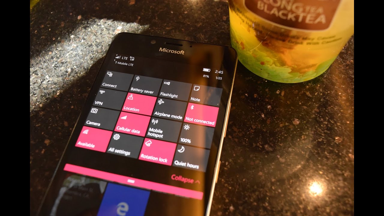
Windows 10 Mobile's Action Center is a massive improvement over its Windows Phone 8 counterpart. In addition to having access to more than one row of quick action buttons, it also features a touch gesture to access the more advanced settings behind each function.
To actuate it, press and hold any of the quick action. What comes next depends on the particular action. For example, holding on the Bluetooth action will open the Bluetooth settings page. Holding on the Brightness action gives you the display settings page (which is also where you'd be taken for the Rotation lock action).
In keeping up with the latest in fashionable beta OS trends, this feature's implementation is far from polished.
For instance, you'd think holding on the Camera action would lead you to the camera's settings, but instead it does nothing. It releases the action center, suggesting it has registered your gesture, but nothing comes after. Same misleading teasing happens with the Flashlight action.
It isn't even consistently misleading. Where holding the Camera action leads you to a dead end, holding the Note button does the same thing as pressing the note button: sending you into a new page of OneNote Mobile. Science has yet to adequately explain why these two actions have completely different gesture outcomes.
For the actions that do have corresponding settings destinations, the journey to that destination is very sloppy. For example, if you hold the Quiet hours action while on the start screen, you get sent to Cortana's Quiet hours settings. Once you're done fiddling around, you'd think hitting the back button would send you right back to the start screen where you came from.
It doesn't. It sends you to Cortana's main page, even though you never went there to begin with. God help the poor soul that clicks on either Brightness or Rotation lock, because not only might he get to watch the Settings app clumsily invoke itself and stutter a page or two to get there, he also has to navigate backward through the entire settings hierarchy just to get back to where he was before.
If you didn't think this behavior could be any more unpolished, it does. Because even in this behavior, it's not consistent. "Some" settings work exactly like they should: Bluetooth, for instance, navigates directly to the Bluetooth page in the Settings app (the same app the OS stumbles through to get to the Brightness/Rotation lock settings), and when you hit the back button, it goes right back to where you came from.
I could understand the different behavior with the Cortana app, since it goes through a completely different navigational structure, but Bluetooth and Brightness/Rotation lock, all lead to the same app, and yet have completely different navigational consequences.
Комментарии
 0:02:15
 0:03:22
 0:01:08
 0:01:50
 0:01:50
 0:02:01
 0:03:30
 0:02:03
 0:01:21
 0:02:16
 0:01:19
 0:02:12
 0:01:44
 0:01:29
 0:00:24
 0:02:18
 0:06:50
 0:01:40
 0:00:40
 0:01:48
 0:00:52
 0:00:48
 0:07:45
 0:07:21