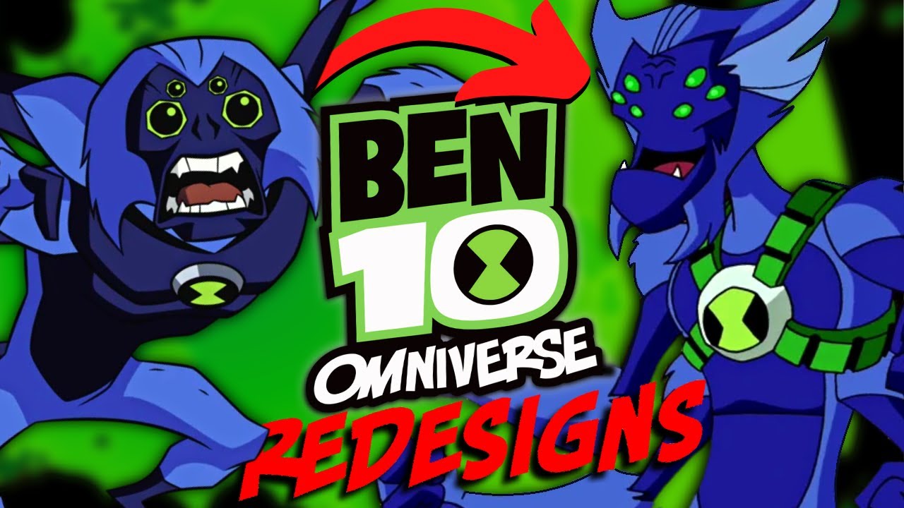
Ben 10 Omniverse REDESIGNS: For Better or Worse?
preview_player
Показать описание
Time to go through all the Ben 10 Omniverse art style redesigns, for all the aliens, and some of the main Ben 10 cast...and finally put to rest the Omniverse art style debate. Is it better or worse? Let me know in the comments below, and leave a like if you enjoyed!

Sidenote: Sorry about the black screen at 2:54, that should've been Upgrade's voting... :P
-

-
RELATED VIDEOS/PLAYLISTS:
-
MUSIC:
Adult Swim Pools
Ben 10 Protector of Earth - Kevin Boss Battle
Caravan - Whiplash Soundtrack
Adult Swim - Lines of Power
Darren Lloyd - All of Me (Trumpet)
Ben 10 Cosmic Destruction - End Credits
Omniverse DS Soundtrack - Main Menu
TF2 Soundtrack - A Little Heart to Heart
TMNT 2K3 Soundtrack - Sewers
Seven Nation Army Band Cover
-
TIMESTAMPS:
0:00 - Introduction
0:54 - Classic
5:16 - Alien Force
8:42 - Ultimate Alien
10:33 - Main Characters
11:34 - Stats and Conclusion

#Ben10Omniverse #Redesigns #Ben10 #AskAir #MrAskAir

Рекомендации по теме
Комментарии
Автор

Thanks for watching! Which designs are your favorites?


AskAir
Автор

I love how Ben's Omniverse design blends elements from both his original series and AUF, bringing back the striped shirt and pants from the former while incorporating the green and black colours and 10 symbol from the latter.

acmeanvil
Автор

I really love the idea of Swampfire having a bloosomed form, but the desing is kinda eeh, maybe if he wasn't so bright green.

zamuda
Автор

Honestly super agree on the Gwen part. Her best design was her omniverse flashback look when she left ben for college. But the rest of the omniverse with glasses and the weird look just didn't look right

bluenitethewarrior
Автор

I almost never like the "nostalgic" reason, for judging which is better, unless it's a consistent branding thing.
Ditto, Eatle, and definitively Shocksquatch are the closest.

Ztrotex
Автор

*Ben 10 fans react when seeing OV art style for the first time be like:

"Look at how they massacre my boy"

*After watching the Reboot:

"Maybe i treat you to harshly"

bismarsyauqie
Автор

ov's biggest problem was usually overdesign. when it followed a "less is more" approach, it usually did a pretty good job.

pikminman
Автор

What about ghostfreak? He had a really good redesign in omniverse imo

webtely
Автор

I actually always really liked Waybig's cheek things. In the original series, they were supposed to be another set of eyes. And personally, that always made sense just bc of how tall he is, he'd need a better field of view so he can see where he's stepping. Notice he never really acts too clumsy with Waybig until after he loses those second pair of eyes

totallytravicious
Автор

Personally I always hated UAF Way Big because he seemed alot more generic and oversimplified compared to what came before

xx_v_xx
Автор

I like how later in omniverse, after Ben met other aperplexians, rath got clothes, after realising he was running around naked since aperplexians wear clothes

disneygamerdonut
Автор

Actually, fun fact, the reason why Ditto acts a lot more like a classic goofy looney tunes style character is actually because I believe both his Classic and Omniverse versions are voiced by the same person who voices Wakko Warner

As well as that, the “two things” on Waybig’s cheeks are actually supposed to be two extra eyes that allow him to look at everything below him without needing to bend down to do so

maxzapsgamingzepzeap
Автор

The two things in way big's cheeks are actually eyes so it they can see downwards, or at least i heard this somewhere. Anyway thanks for the video! Waited a long time for this!

SorcererSupreme
Автор

If Omniverse Upgrade had the Omnitrix in his chest rather than his eye, he'd 100% be the best design in my opinion.

matti.
Автор

I don’t hate the swamp fire redesign but it is a definite step down. Big chill I’m really divided, sometimes I like the more gross bug-like OV design and other times I like the sleeker thinner UAF design.

daepicsunglassesemojidude
Автор

7:29 The thing I really like about Goops redesign is that the Omnitrix was moved from his goo body onto the gravity projector eliminating the weakness that Ben used to defeat Vilgax that one time he actually got the Omnitrix it shows a good attention to detail

devinnall
Автор

My opinions
Heatblast: Omniverse, it loooks more bulky and cooler and i love more the darker colors
Wildmut: Omniverse, I love the colar and thats it, It doesnt change that much
Four Arms: Ultimate, It looks a lot cooler than the classic, gives me Gladiator vibes and the Golden bracelets are cool as hell
Grey Matter: Omniverse, The outfit makes him looks like a spy or someone ready to figth
Ripjaws: Omniverse, i love both versions from classic and omniverse a lot but i give the edge to classic for looking more fish than human
Stinkfly: Classic, i like Stinkfly from omniverse but Stinkfly in Classic is a lot more alien like in classic
Diamondhead: Ultimate, with no doubt my favorite version because the Dark Blue works wonders with him
Upgrade: Ultimate, It looks more solid than the other 2 versions and i Love more the Black and Green pallets
Cannonbolt: Ultimate, more solid overall and less weird
Upchuck: Omniverse, both versions looks more detailed and less weird
Ben Wolf/Blitzwolfer: Omniverse, i like both versions but Blitzwolfer has more personality on the design
Ben Mummy/Snare-Oh: Omniverse, i Love the egypt pharaoh aestetic and gives more personality
Ben Viktor/Frankenstrike: Omniverse, more personality and scars
Ditto: Omniverse, it looks a lot cute and kinda like a mole
Eye Guy: Omniverse, Both are too similar to decide but omniverse because the pants
Way Big: Ultimate, It looks more cool and more organic than the other 2 versions who look a lot robotic
Swampfire: Definitely Omniverse, it is cooler and i Love the head design
Echo Echo: Alien Force, the Omniverse version it's too ugly and easily forgetable design
Humongosaur: Alien Force, A lot more dinosaur like and less weirdly shaped like in Omniverse and i Don't like the underwear and belt, too unecessary
Big Chill: Alien Force, It looks a lot more moth like instead of weirdly beefy and desproportional

Eric
Автор

Ngl while I love Space Chad. The UAF design overall looks menacing - I think the writers were trying to make him an intimidating horror monster-like being, which actually fits because that Alien X voice kinda sounds like Gods and Angels were shouting. along with that flashy lights revealing his first look. Idk if that makes any sense

grassfinnsword
Автор

I liked Omniverse because the show explored on different alien species much better than the previous shows and Ben gets to use a lot of his underrated aliens. The change in art style regarding the aliens is acceptable to me as they give different aliens more personality appearance wise and makes them boldly stand out. Some of the aliens might look goofy, but it makes them recognizable as we are greeted with more and more species of aliens. The anticipation of seeing a new alien in the Omniverse art style is also part of the fun of watching the show. The changes to each alien aren’t necessary, but it made me enjoy the show a lot more.

PureGarbageWithCheese
Автор

UAF way big looks too simple. Has the less amount of detail. Which is shown more in his ultimate form. Just looking even more lazy and plain. The other two way bigs are better but classic is the best because most detail and lore being why he has 4 eyes

flashygreenx