filmov
tv
How to Integrate UI Components Inside the React Tabs Component
Показать описание
Learn how to integrate other Syncfusion React components into the React Tab component. In this video, you will learn how to use the React Charts, Calendar, and Dropdown List components as individual tab items using a template.
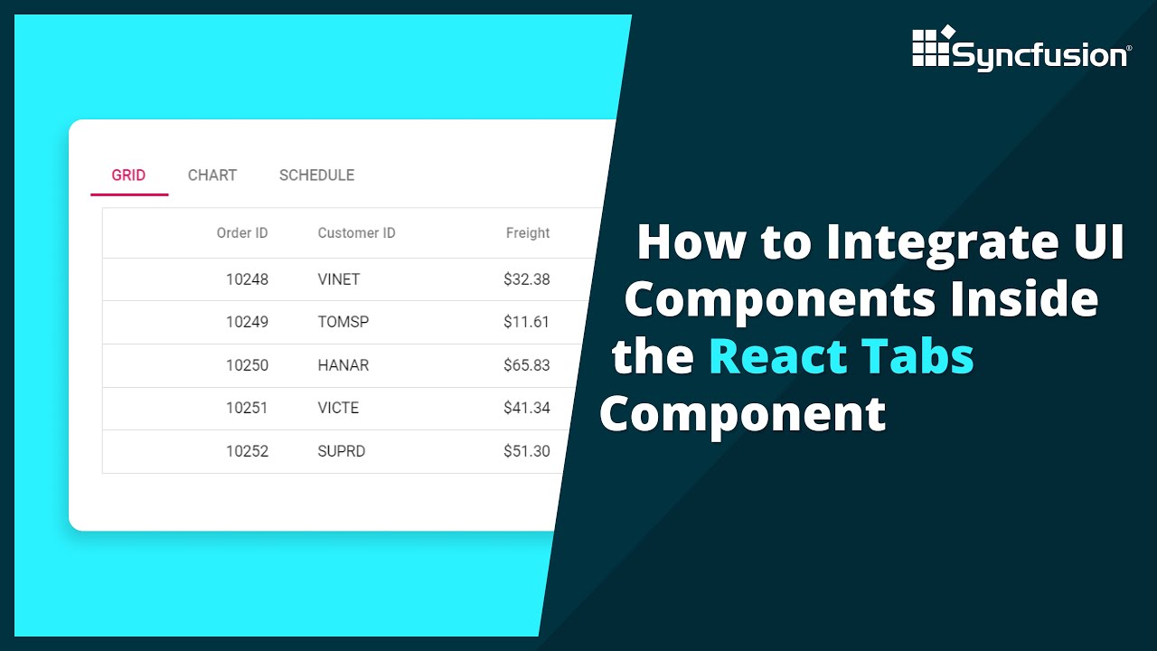
The React Tabs component is a content panel showing multiple categories of content in a compact space, organized into tabs.
The React Tabs component is a simple user interface (tabs UI) for organizing related content and occupying a compact space.
The tabs are aligned horizontally, and each tab is associated with its header. One of the tabs must always be selected and visible. The Tabs component has a rich set of features such as animation, orientation, templating, header styles, a close button for each tab, a scrollbar or pop-up when there are many tabs, JSON support, and more.
The Tabs component provides a clean and organized way to present multiple sections of content. Users can easily switch between different tabs to view different information.
The React Tabs component allows you to organize content into multiple tabs, enabling users to switch between different sections of your application with ease. You can customize the appearance of the tabs by applying different styles, such as Bootstrap, Material, and Fabric styles, or you can create your own custom styles to match your application's design. You can choose to position the tabs at the top, bottom, left, or right of the content area, depending on the application's layout requirements.
Download the example from GitHub:
TRIAL LICENSE KEY
---------------------
Check if you are eligible for a free license for all Syncfusion products on our Community License page.
BOOKMARK DETAILS
---------------------
[00:00] Introduction
[00:11] Overview of the app
[01:04] Add the Charts component to Tab component
[03:33] Add the Calendar and Dropdown List components inside the tab
REACT TABS
---------------------
SUBSCRIBE
----------
SOCIAL COMMUNITIES
-------------
#react #tabs #navigation
 0:08:23
 0:06:27
 0:11:28
 0:04:47
 0:43:33
 0:07:29
 0:17:28
 0:22:59
 0:14:01
 0:02:02
 0:06:19
 0:05:03
 0:08:33
 0:22:00
 0:17:29
 0:05:00
 0:40:05
 0:15:23
 0:11:28
 0:05:03
 0:01:51
 0:12:30
 0:05:34
 0:01:00