filmov
tv
Figma's New UI comparison

Показать описание
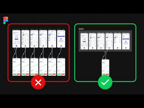
Here’s a comparison I did of Figma’s new UI side by side with the older one.
Here's my official Figma paid course which you can check out on:
Use the AMSUBSCRIBER voucher code to get 50% off! (If the voucher is still active)
Be sure to subscribe and hit the notification icon! It really helps me help you and others like you be better designers, freelancers, entrepreneurs, and people in general!
.
Subscribe to my newsletter to keep up to date on latest design/tech trends, update, tools and information! 🔥
.
.
👉 Follow me on Twitter and LinkedIn for more content.
.
Need design or development support?
00:00 - First Marker
00:41 - Top bar changes
01:19 - Sidebars Spacing Change
02:11 - Heirarchy Issue of headings
03:29 - Tap Area difference Sidebar
04:11 - Dynamic Sidebar
04:50 - Different icons for Effect
05:29 - Accessibility downgrade
06:14 - Shape Modification buttons
 0:09:08
Figma's New UI comparison
 0:07:30
Figma BIGGEST Update! – New Animations, UI Features, & More
 0:05:16
Figma Vs Motiff - New AI Design Tool! | Better Pricing, AI UI Design, Design Systems & More
 0:06:18
New Design Systems & UI Kits 2024! – Figma, Design To Code & More
 0:02:06
Figma VS Adobe XD (2023) - Best Web Design Tool ?
 0:12:01
This Figma UI Kit is a Game Changer | Untitled UI
 0:00:57
What happened to constraints in the new Figma UI?
 0:04:09
FIGMA VS SKETCH | THE CHOICE IS CLEAR, ISN'T IT??
 0:04:18
Animate Icons in Figma with ONE CLICK!
 0:10:04
New UX/UI Design Trends by Apple, Netflix & More! + Figma Tutorial
 0:11:22
Figma's new competitor? | This AI tool will make UI UX design 10x faster
 0:07:23
Figma UI: New UI 3 vs Old UI 2 - What's Changed?
 0:11:12
Figma Tutorial: Compare websites behind a login with Figma designs
 0:05:41
Reduce Prototypes by 50% (Simple trick) | Figma Tutorial
 0:00:34
Figma VS Adobe XD: What is the best UI/UX design tool? #shorts #figma #adobexd #design #figma
 0:09:22
Figma Free vs Pro
 0:11:05
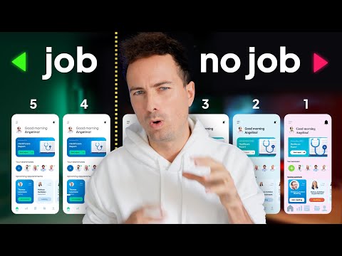
5 levels of UI skill. Only 4+ gets you hired.
 0:08:50
Is Figma's New UI3 Worth the Wait?!
 0:20:10
8 UI Kit & Design System Figma Plugins 2023
 0:00:32
BEST FREE UI/UX Design Courses 💻 | Free FIgma Courses 💥 | Saptarshi Prakash
 0:00:40
UX has a Figma problem... #design #ui #figma #ux
 0:12:06
Figma UI 3 - First Look at the New Experience
 0:00:40
FIGMA VS ADOBE XD & SKETCH 2023 (The best)
 0:06:04
UI vs UX Design in Figma
Комментарии