filmov
tv
Logo Comparison #2: 20th Century (Fox) Studios
Показать описание
A week ago, this one has been requested by TheLogoFan. Today, we're looking at the 20th Century (Fox) Studios logo.
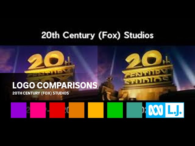
In the 20th Century Fox logo (on the left), it's a redone and more realistic version of the 1994 tower. This time, it is in a dark/orange evening environment. When the structure is in its distance, we can see an extra searchlight and a pair of palm trees on the bottom right hand corner. This structure, like the 1994 structure, also looks similar to the 3rd logo.
In the 20th Century Studios logo (on the right), this is nearly the same as the final 20th Century Fox logo, except "FOX" is replaced with "STUDIOS", and "CENTURY" is taller to accommodate for it. There are also some additional changes like a different sky backdrop and sleeker looking searchlights.
So, which logo comparison will I do next? Please comment down below!
Follow me on:
Most of the content shown in this video is owned by someone else, or specifically me. All rights go to the original owners of the content shown in this video. This is being uploaded for preservation and entertainment purposes only. Please do NOT steal this video without permission, and if you comment using curse words (e.g. F***), then I'll remove them and block you forever!
Copyright © 2020-21 L.J. Operations, Inc. All rights reserved. Unauthorized copying, reproduction, distribution, exhibition or other public performance or export or import of this video or of any part of it without the prior written consent of the copyright owners. This is expressly prohibited by the laws of Australia and the rest of the world, and may result in legal action.
 0:00:22
Logo Comparison #2: 20th Century (Fox) Studios
 0:00:22
20th Century Fox logo comparison (Original and iVipID)
 0:00:24
warner cinema and 20th century disney comparison
 0:00:30
The ULTIMATE 20th Century Studios logo comparison
 0:00:26
20th Century Fox Logo comparison 1994 vs 2009
 0:00:24
20th Century Fox Home Entertainment Intro Comparison
 0:00:23
20th Century Logo Comparison - 2011 & 2020
 0:00:22
20th Century Fox (X-Men Variant) (2000 vs. 2014 Comparison)
 0:00:47
(2) 20th Century Fox and 20th Century Studios Comparison(s) (HD)
 0:00:22
20th Century Studios Logo Comparison
 0:00:23
20th Century Fox 2009 Remake Comparison 400 Subscribers Special
 0:01:02
2 20th Century Fox's Remakes Comparison (Destroyed VS Original)
 0:00:22
20th Century Fox (2009-2024, logo) Comparison LEGO (September Updated, 2019)
 0:00:29
20th Century Fox Logo Comparison
 0:00:22
20th Century Studios 2021 logo comparison
 0:00:22
20th century fox Home Entertainment Comparison
 0:00:22
20th Century Fox 1994 Logo Comparison
 0:00:26
All 20th Century Fox 1994 Logo Comparisons (For Tyler J)
 0:00:24
20th CENTURY FOX Yee & Kirby Side By Side Comparison
 0:00:26
20th Century Fox and 20th Century Studios Comparison
 0:00:49
(2) 20th Century Fox and 20th Century Studios Comparison (s) (HD)
 0:00:22
20th Century Fox 1994 Logo Normal and Backwards Comparison (WARNING: CONFUSING)
 0:00:34
20th Century Fox (1994) remake comparisons
![[NO SPAMMERS ALLOWED]](https://i.ytimg.com/vi/aYXq_EcaRNk/hqdefault.jpg) 0:00:22
0:00:22
[NO SPAMMERS ALLOWED] 20th Century Fox and 20th Century Studios (Comparison)
Комментарии