filmov
tv
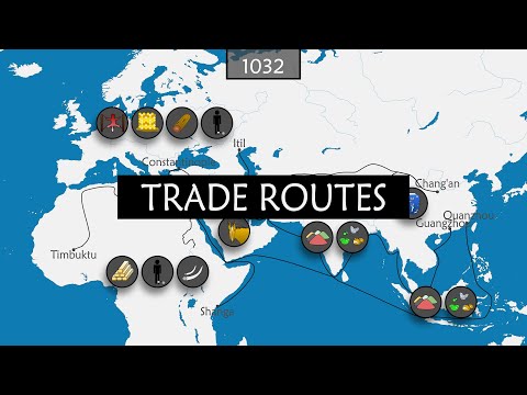
How to Map Trade Routes with R

Показать описание
Do you want to learn how to create stunning trade routes maps using a huge database of international trade data? In this tutorial, I'll show you how to use the United Nations Comtrade database, which contains over 1.5 billion records of trade flows between countries. You'll learn how to use ggplot2 in R to create great circles that show the trade relationships of the largest wheat exporters in 2022.
Chapters
0:00 Intro
00:44 Packages
03:32 Comtrade API
06:17 Search Comtrade database
08:15 Wheat exports for Ukraine
10:29 Explore data
12:08 Fetch capitals
15:23 Start/end points
19:36 Create lines
22:15 Merge data
23:23 World shapefile
24:21 Points
26:13 Map 1 - no labels
42:19 Map 2 - labels
46:13 Multiple exporters
49:44 Add reporter iso
50:09 Multiple start/end points
50:29 Map 3 - trade network
55:01 Final thoughts
Check the full code in my GitHub repo:
Follow my work on Instagram:
Let's connect on X:
If you like my work, consider buying me a coffee:
Comtrade website:
Music credits:
---------------------------------------------------------------------------------------------------
Music By: massobeats - midnight (lofi aesthetic music)
 0:11:50
How do Teyvat's trade routes work?
 0:19:42
History of the Major Trade Routes - Summary on a Map
 0:05:14
Trade Routes in No Man's Sky Explained and How to Utilize Them
 0:18:02
5 EXPERT TIPS FOR YOUR TRADE ROUTES!! Anno 1800
 0:02:21
English Channel trade routes map | Trade shipping routes through English Channel || 5min Knowledge
 0:12:47
Anno 1800 Guide - Creating Trade Routes
 0:55:52
How to Map Trade Routes with R
 0:01:21
Top Trading Routes in the World - Visualized on the Map
 0:12:00
Civ VI: The Ultimate Guide to Trade Routes
 0:02:36
World Map of Ship Routes
 0:03:48
Trading Routes in The Roman Empire
 0:00:17
The silk route trade #route #world #shorts #maps #road
 0:17:19
Major Maritime Trade Routes
 0:14:37
Bannerlord Trade Routes Basics - Across Map & Town-to-Town Trading Guide (Best ITEMS to TRADE)
 0:05:02
How to SET Trade Routes - ANNO 1404 Venice Tutorial (Mini Series)
 0:14:13
Sea of Thieves: Emissary Trade Routes Guide
 0:02:01
Pacific Ocean Trade Routes | Trade shipping routes through pacific Ocean || 5min Knowledge
 0:13:25
Anno1800 - 'Trade Routes & Charter Routes' Tutorial
 0:06:21
Top 8 Global Shipping Routes
 0:05:46
Countries and Trade Routes near Mediterranean Sea
 0:21:30
Tradelands Nation - The Best Trade Routes in Tradelands
 0:00:49
How Trade Routes Shaped Our Languages
 0:13:56
How The Vikings Kept The Whole Europe At Bay? Animated Map
 0:00:12
india to usa sea route #route #shorts #world #maps
Комментарии