filmov
tv
Kitchen Makeover: A Beautiful Lakefront Kitchen

Показать описание
See how designer Jessica Kelly brought the colors of the lake into this charming family kitchen. The rich blue-green island is accented with a leathered granite countertop, while a rustic steel vent hood and matching sconces add a hint of drama. You'll love the character-driven beadboard ceiling and antique mirror cabinet fronts. Plus, the banquette is perfect for the whole family to gather around for casual meals.
----------
MORE DESIGN INSPIRATION
----------
CONNECT WITH HOUSE & HOME!
----------
MORE DESIGN INSPIRATION
----------
CONNECT WITH HOUSE & HOME!
 0:04:48
Kitchen Makeover: A Beautiful Lakefront Kitchen
 0:04:19
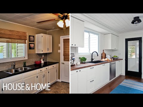
Budget-Friendly Cottage Kitchen Reno
 0:00:15
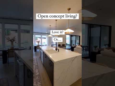
Open Concept Kitchen| Remodelaholic
 0:00:17
Garden Patio Design with Natural Pebble Stone
 0:06:22
Cottage Makeover: 60s-Inspired Lakefront Cottage In Quebec
 0:00:16
Luxury Kitchen Design #kitchen #shorts
 0:00:15
Luxury Bedroom Interior Design 🤩 #shorts
 0:00:16
Living Room with an Open Kitchen Design 🤩#shorts
 0:02:52
3834 Mambrino Highway Granbury, TX 76048
 0:01:01
How much I charge to paint kitchen cabinets
 0:00:10
Seriously cool indoor outdoor kitchen idea Slay Lifestyle
 0:00:14
Beautiful Kitchen Design Idea 🤩 #shorts #kitchen
 0:00:12
Enormous custom limestone estate with negative edge pool, overlooking Orchard Lake! #luxury #homes
 0:00:14
Modern Kitchen Design 😱 #shorts
 0:00:13
Gourmet Kitchen Design🤩#shorts #kitchen
 0:00:09
Beautiful small house immersed in peaceful nature.
 0:00:15
Luxury Kitchen Design ✨ #shorts
 0:00:15
✨Open-Concept Kitchen Design | ALANA Bay Harbor Islands #shorts
 0:00:11
✨Modern Kitchen Design #shorts #kitchen
 0:00:16
Renovated Lakefront Vermont Farmhouse | Vermont Homes for Sale | Lake Champlain
 0:00:15
Tour This R4.7m Family Home In 15 Seconds! 🏡 #valleyviewestate #luxurylifestyle
 0:00:16
Lakefront Kitchen with Stained Hickory Shiplap Hood | www.remodelmarket.com
 0:00:22
Beautiful home on East Lake Okoboji featuring Cambria Ironsbridge in the kitchen.
 0:00:16
Luxury Kitchen Design Idea ✨#shorts #kitchendesign
Комментарии