filmov
tv
Is CS2's Inferno Too Detailed?

Показать описание
With all of the updates Inferno has received since launch, it is apparent that Valve is keen on making it more competitively viable, but are these changes destroying the map's beauty and immersion? Let's take a look...
0:00 Counter-Strike 1999
0:26 Source 2 Capabilities
1:08 "Decluttering" Inferno
1:26 Library
2:11 Garage Door
2:53 Balcony
3:19 Miscellaneous Changes
4:13 The Solution?
5:32 Conclusion
Special thanks to:
• 3kiksphillip for inspiring me to make a CS2 video
#cs2 #counterstrike2
0:00 Counter-Strike 1999
0:26 Source 2 Capabilities
1:08 "Decluttering" Inferno
1:26 Library
2:11 Garage Door
2:53 Balcony
3:19 Miscellaneous Changes
4:13 The Solution?
5:32 Conclusion
Special thanks to:
• 3kiksphillip for inspiring me to make a CS2 video
#cs2 #counterstrike2
 0:00:38
PLAYING CS:GO THEN vs NOW
 0:01:00
CS2 INFERNO LEAKED (VALVE RESPONDED)
 0:01:59
the CS2 INFERNO REWORK will be INSANE!
 0:00:11
VAPING GAVE US CANCER #stopvaping
 0:00:07
Separ Cynthia 🐷💗
 0:01:08
new cs2 map overhauls
 0:00:41
kennyS or GuardiaN? - 'This or That?' w. s1mple & NPL
 0:00:52
What CS:GO tricks work in CS2? (Nuke)
 0:00:11
THIS PRO PLAYER WILL BE BANNED FOR ABUSING THIS BUG
 0:00:30
I miss css
 0:00:57
CS2 Map Tier List w/ NAF & Yekindar #gaming #CS2
 0:00:31
How to Repeat The craziest killfeed CS:GO
 0:00:53
CS2: Almost Undefusable Bomb on Inferno?
 0:00:20
Happy Birthday Song With Inferno Bells CS2 🔔 🎶
 0:01:51
Valve's War with Silent Drops
 0:03:07
Nuke Map Comparison CS: Source, CSGO, CS2
 0:00:10
what 1000hrs of aim training looks like
 0:00:43
SHOULD CS2 DECLUTTER MAPS?!
 0:00:59
That NAVI Sticker is MINTY
 0:00:17
IMAGINE BUYING A KNIGHT FOR $33
 0:00:21
Ropz Talks On MR12 In CS2 #cs2 #shorts
 0:00:11
Remember this smoke! #shorts #cs2 #csgo #gaming
 0:00:14
CS2 vs CSGO Glass Physics
 0:03:04
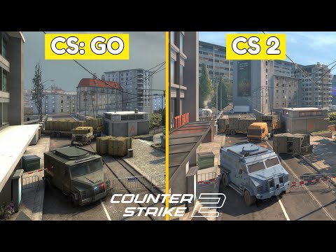
Counter Strike 2 Vs CS GO Graphics Comparison | Map Comparison
Комментарии