filmov
tv
Worst Logo Changes in Football

Показать описание
Football crests that got worse after the redesign… Part 1:
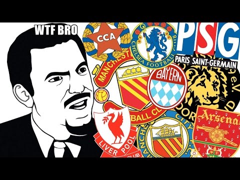
Juventus — 2015/16: A classic case of over simplification in modern logo design, this effort saw Juve do away with the shield (used from 1905-1977, then 1989-2016) in favor of the letter J. There’s not much else here to say.
LaLiga — 2023/24: From 1994-2023, the Spanish first division was represented by the iconic ‘color wheel’. Now, it’s just the letters ‘LL’ in a coral pantone that literally just looks like a 4. In my opinion, this is the one of the worst rebrands ever.
Leeds United — 2019/20: In honor of their centenary season, Premier League side Leeds United decided to change their crest, which has remain largely unchanged since 1998. Despite over 6 months of work—including the consultation of “over 10,000” fans, the final product ended up looking more like a bad esports template than a professional football crest. Within days, over 77,000 fans had signed a petition for the club NOT to change the logo, prompting them to forgo the rebrand altogether. Classic.
Which football logo rebrands do you think failed miserably? Comment below for a chance to be featured in part 2 👀
And lastly, big shoutout to twitter user/ STJAMESSAN for the inspo behind this video. #football #logo #design #sports #soccer #futbol #fail #juventus #laliga
 0:00:59
Worst Logo Changes in Football
 0:05:56
10 WORST Logo Changes in Sports
 0:01:38
10 best and worst football club logo changes
 0:00:31
Footballs WORST Logo Changes 😡😡😒🤮🤮🤢#shorts #football
 0:00:58
The Worst Football Badges of All Time🤮😷
 0:06:01
Worst Logo Changes in Sports History
 0:00:42
TOP 5 - Worst football logos
 0:00:14
Worst of the worst sports team logo redesigns #shorts | tylietok
 1:31:15
Can I Rebuild The WORST SEC Team in College Football 25?
 0:00:14
Worst sports logo changes of all time #shorts | tylietok
 0:00:14
Worst logo redesigns in recent years #logos | tylietok
 0:12:35
The 5 BEST NFL Logo Changes...And The 5 Absolute WORST Of All-Time
 0:00:14
#Worst logo #redesigns of all time! #shorts #reranding
 0:03:36
Top 27 Worst Club Badges in world football
 0:00:14
Worst sports team logo changes if all time #shorts | tylietok
 0:00:14
These are the worst sports team logo changes ever #shorts | tylietok
 0:13:44
Who Has The WORST Logo In College Football?
 0:00:14
The most recent controversial logo redesigns! #logos #redesign #rebrand #shorts #logodesigner
 0:00:37
The Worst Logo in Sports
 0:00:25
Worst NFL Logos
 0:00:04
Chat GPT’s best and worst logos #football #nfl
 0:00:09
Worst logo change NFL
 0:00:40
Worst Fake Football Kits…
 0:00:35
3 NFL Logos That Got REJECTED🚫 | #shorts #nfl #rams
Комментарии