filmov
tv
Learn how to use Media queries & Container queries

Показать описание
A dive into the world of media queries and container queries, covering the basics of how each works, the differences between them, when you might want to use one over the other, and more.
🔗 Links
⌚ Timestamps
00:00 - Introduction
00:55 - New merch!
01:27 - Media query basics
03:20 - Updating custom properties with media queries
05:00 - Creating ranges
07:35 - The new syntax
10:25 - Media queries are for more than only the size of the viewport
12:07 - Container query basics
15:23 - The difference between media and container queries
19:53 - Naming our containers
22:00 - container shorthand
22:30 - Quick recap
23:05 - Container Query Units
27:00 - Might be worth defining the html element as a container… maybe
28:58 - Style queries
32:50 - Which one should you be using?
#css
--
Come hang out with other dev's in my Discord Community
Keep up to date with everything I'm up to
Come hang out with me live every Monday on Twitch!
---
Help support my channel
---
---
I'm on some other places on the internet too!
If you'd like a behind the scenes and previews of what's coming up on my YouTube channel, make sure to follow me on Instagram and Twitter.
---
And whatever you do, don't forget to keep on making your corner of the internet just a little bit more awesome!
 0:34:33
Learn how to use Media queries & Container queries
 0:04:30
Tutorial: Learn how to use CSS Media Queries in less than 5 minutes
 0:03:00
Learn how to use AR-media in under 3 minutes
 0:01:12
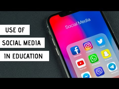
How Social Media Transforming Future Of Education | Social Media Use In Education | Role
 0:24:54
Learn How to Use Media to Your Advantage
 0:05:12
Fair Use - Copyright on YouTube
 0:08:55
How To Use Hootsuite in 8 Minutes 2024 (Best Social Media Management Tool)
 0:10:40
The best way to use media SUBTITLES to learn Spanish effectively (don't make this mistake!)
 0:04:48
'Scrolling Smart: How to Master Responsible Social Media Use'
 0:12:13
How to Use Social Media for Language Learning
 0:48:22
Effective Use of Media in the Classroom
 0:03:42
Learn From My Twitter FAIL - How to Use Social Media and Analytics to Promote Your Content
 0:08:27
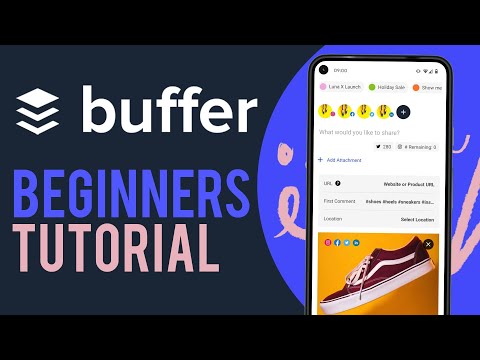
How To Use Buffer Social Media Management (2022)
 0:13:36
How To Use Hootsuite For Beginners 2024 (Social Media Management For Your Business)
 0:17:31
Do You REALLY Know How To Use Social Media Properly? HINT: Most Get The Marketing Basics Wrong!
 0:07:40
I Was Shocked When I Learned About This
 0:09:37
The Right Way to Use Social Media | Paula La Croix | TEDxYouth@TBSRJ
 0:00:16
The Right Way to Use Social Media in Business #entrepreneur #business
 1:28:34
Learn playfully and use media critically with fun
 0:12:52
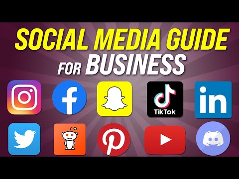
How to Use Social Media for your Business
 0:02:14
Learn how to use Social Media. - DE - Digitalize
 0:01:09
How did you learn how to use social media?
 0:01:49
AI in Social Media | How Social Media Platforms Use AI Explained | Learning Spiral AI
 0:02:03
How to Use Social Media to Learn About Athletic Programs
Комментарии