filmov
tv
Pearl White Puddles turned out Amazing! | Acrylic Pouring | Acrylic Painting
Показать описание
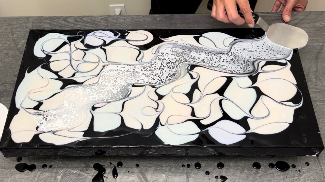
I just love this acrylic pour!! These gorgeous pearlescent colours and really crisp lacing just made everything look fantastic. I really love to work with these colors because they are a little bit mysterious , but always turn out to look incredibly pretty!
I decided to use a bit more paint in my colours this week and the painting just looks so much more vibrant and has dried just as bright! Have you had a chance to use pearlescent's before?
I'd love you thoughts and feedback on this swipe, so please let me know in the comments!
Please consider clicking the Like Button if you enjoyed the video to help it spread to others who may enjoy this content.
Thanks for watching!
Tony
Watch These Next!!
Colours Used
Pearl Red
Pearl Blue
Pearl White
Pearl Green
Amsterdam Titanium White Cell Activator
#acrylicpouring #fluidart #abstractart
** Other ways you can support me and this channel**
▪️Like and Subscribe to my channel if you enjoy my content
▪️Say Thanks! You can donate tips (for coffee) through YouTube supers above!
▪️Share my video to your friends and those who may enjoy it!
Your support goes a long way allowing me to continue to make the highest quality videos I can for everyone, so thank you!
**Affiliate links to tools I use!**
**My Amazon Favourites I Use!**
🎥 Equipment I Use (I have purchased all of these products and just love them!)
***Products I Use For Magnets!**
** Follow me on my socials**
Disclaimer
As an Amazon Associate I earn from qualifying purchases at no additional cost to you.
 0:10:42
Pearl White Puddles turned out Amazing! | Acrylic Pouring | Acrylic Painting
 0:08:59
Gradient Pearl Puddles! - This Turned Out Amazing! Acrylic Painting - Acrylic Pouring
 0:10:45
WOW! Which Color had the biggest SURPRISE?! BEAUTIFUL Liquid Puddles + Negative Space
 0:17:39
'La Marea” 24'x36' PEARL CELL PUDDLE POUR USING AMSTERDAM MIXTURE
 0:12:10
The BRIGHTEST Pearl Puddles I've Ever Made! Acrylic Pouring
 0:10:36
Bright and BEAUTIFUL Pearl Puddles! Acrylic Pouring & Fluid Art
 0:07:28
Acrylic Pouring Techniques: Puddle, Pearl and a Dump and Swirl 140 #fluidart #acrylicpour
 0:11:54
I Tried Lines Instead Of Puddles and I LOVE It! - Acrylic Painting w/ Pearl Paints - Acrylic Pouring
 0:06:37
#102 Fluid Painting _ Pearl Puddle Pour - Cool Pearl Cells, White and Bronze No Silicone
 0:06:44
Puddle Pour with Colored Pearls #fluidart #acrylicpour #abstractart 232
 0:06:15
Pearl Style Acrylic Puddle Pour #fluidart #acrylicpour #abstractart 209
 0:10:20
An Iridescent Surprise! Bright & Beautiful Acrylic Puddle Pour! | Acrylic Pouring
 0:08:48
MY FAVORITE Puddle Pour of All Time! | Acrylic Pouring with Metallics!
 0:00:53
Liquid Puddles of Gold and Metallics Turn into Something Awesome! #shorts
 0:08:27
#125 INCREDIBLE Pearl Puddle Pour 🤩 This Paint Reaction Is Crazy!!! Fluid Art Painting
 0:09:30
#120 🌸Blossoms🌸 Pearl Cloud Over Puddle Pour - Magenta and Grey Negative Space - Fluid Art Tutorial...
 0:17:29
#75 Puddle Pour turned Bloom
 0:05:41
Puddle pour with resin 😮 how to easily make a glamorous resin tray / resin art for beginners
 0:07:34
#124 ONE PUDDLE POUR - Pearl Pour With Satin Enamel And Blue Sapphire And Turquoisegreen - Fluid Art
 0:10:21
#103 Cloud Over Puddle Pour - White Pearl Cells _ Fluid Art Painting
 0:16:26
COMBINATION PEARL CELL PUDDLE POUR AND A SWIPE!! Fluid art tutorials
 0:19:02
How To: Puddle Pour with a swipe and stretch
 0:20:23
WOW! Multi-Color Puddles with Pearls on Top! - Acrylic Painting - Fluid Art - Acrylic Pouring
 0:00:20
BASS INHALES TEXAS RIG! #shorts
Комментарии