filmov
tv
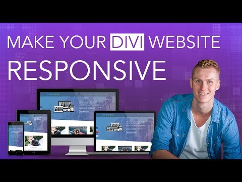
6.6 Optimize your Divi website for mobile devices

Показать описание
A majority of the internet traffic comes from mobile devices so make sure that you have a mobile optimized website. Divi is responsive by default but you still need to tweak your font sizes, padding and other fine tuning for smartphones and tablets.
We'll also explore how to hide and display content for different devices.
All links, files and code snippets mentioned in the chapter is available below. 👇
🔗 AFFILIATE LINKS WITH EXCLUSIVE DISCOUNTS
This video is not sponsored but it contains affiliate links to SiteGround and Elegant Themes. If you make a purchase via these links, I’ll receive a commission. But it will NEVER cost more for you. Your support makes it possible for me to create more free content. Thank you! 🙌
🔗 DOWNLOAD FREE LAYOUTS & OTHER RESOURCES
⚡ DiviMundo was founded in 2017 by Victor Duse, the tutor in this video.
Affiliate disclaimer
We are dedicated to sharing knowledge about WordPress and Divi. Some of the links in this video are affiliate links. This means if you click on the link and purchase the item, I will receive an affiliate commission, but it will never cost more for you. Divi is a registered trademark of Elegant Themes, Inc. DivMundo is not affiliated with nor endorsed by Elegant Themes, SiteGround or any other brand mentioned in this video.
Комментарии
 0:13:29
 0:09:30
 0:11:33
 0:15:17
 0:00:44
 0:11:28
 0:17:45
 0:05:00
 0:07:45
 0:14:42
 0:01:10
 0:22:50
 0:39:43
 0:06:34
 0:00:37
 0:06:46
 0:06:46
 0:06:22
 0:17:47
 0:05:13
 0:08:13
 0:00:36
 0:09:58
 0:00:37