filmov
tv
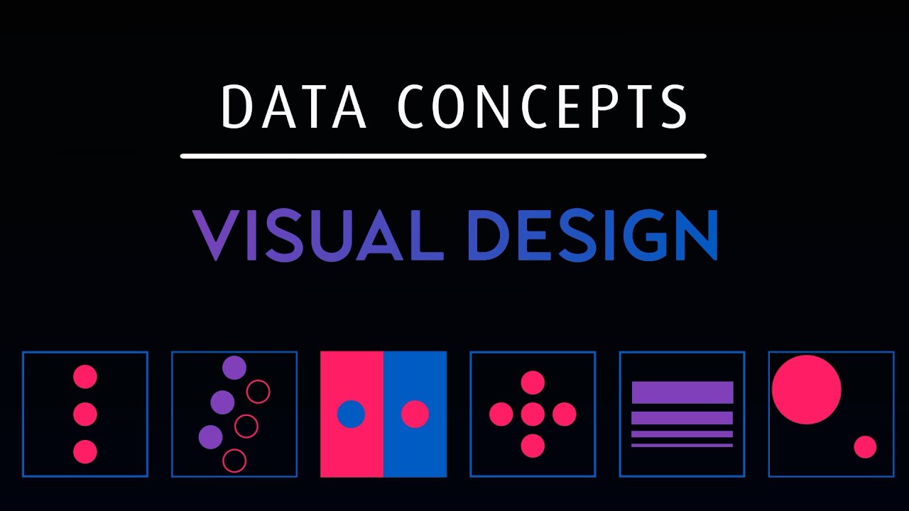
Using Design Techniques for Clear and Appealing Data Visualization

Показать описание
Let's look at how we can implement design concepts and techniques to maximize the impact of our dashboards and reports. We don't want our visualizations to be ugly, but we also want them to clearly convey the data story. We can achieve this balance using some of the same practices graphic designers utilize.
------------------------------------------------------------------------------
⏯RELATED VIDEOS⏯
------------------------------------------------------------------------------
------------------------------------------------------------------------------
🎓Data courses (Not Produced by nullQueries)🎓
------------------------------------------------------------------------------
📷VIDEO GEAR📷
💻VIDEO SOFTWARE💻
------------------------------------------------------------------------------
Some of the links in this description are affiliate links and support the channel. Thanks for the support!
------------------------------------------------------------------------------
00:00 Intro
00:31 Balance
01:02 Whitespace
01:20 Patterns
01:59 Color
02:30 Text
03:04 Picking a Visual
------------------------------------------------------------------------------
⏯RELATED VIDEOS⏯
------------------------------------------------------------------------------
------------------------------------------------------------------------------
🎓Data courses (Not Produced by nullQueries)🎓
------------------------------------------------------------------------------
📷VIDEO GEAR📷
💻VIDEO SOFTWARE💻
------------------------------------------------------------------------------
Some of the links in this description are affiliate links and support the channel. Thanks for the support!
------------------------------------------------------------------------------
00:00 Intro
00:31 Balance
01:02 Whitespace
01:20 Patterns
01:59 Color
02:30 Text
03:04 Picking a Visual
Using Design Techniques for Clear and Appealing Data Visualization
TRANSPARENT SolidWorks Parts by adjusting #clear #glass #appeareance #tips #tricks
Almond Builder Gel Nails W/ White Nail Beds & Clear Tips Done W/ Dual Form Tips
5 tips to improve your critical thinking - Samantha Agoos
Tips, tricks and Techniques ~ Clear Acrylic: Designing + Decorating with UV Roll-to-Roll Printer
Ep. 189| Procreate 5 Techniques: Select, Paint, Select, Clear 2020
Easy French Nail Tips By Soft Clear Nail Stamp! Really a Good Trick!
DIY Gel Nails Tutorial: Trendy Floral Design with Clear Tips and Glitter Gel Polish!
8 Popular Design Trends That FAIL In Real Life
Creating a Clear Type Hierarchy - Typography Tips 3
WOOW! Easy French Nail Tips Design in Seconds with Our Clear Nail Jelly Stamper!
3 tips for creating Clear Social Media Visuals
French Nail Tips Tricks with Our Clear Gelly Nail Stamper! Super Useful!
Crystal Clear Aquarium Water - 5 Tips 💎
This tool will help improve your critical thinking - Erick Wilberding
#nails I’m kinda obsessed with clear tips 😍#nailschallenge #acrylicnails #fyp #
clear skin tips for girls 🦋✨#aesthetic #cute #youtubeshorts
Clear the clutter and reclaim your space with our expert tips for a tranquil and organized home
french tips. clear gel extension 🥰🥰 beautiful art with silver stones...😍😍
HOW TO: Repair my Broken Nail Easily! #nails #naildesigns #nailart #nailtech
How to make clear tips with decoration for the beginner.
SVG or PNG? Must-Know Tips for Crystal Clear Designs!
CRYSTAL CLEAR FRENCH TIPS 🏆 full video up 😍
Microblading Tips | How to Create Clear Hairstrokes #shorts #youtubeshorts #eyebrows
Комментарии
 0:04:17
 0:00:42
 0:04:39
 0:04:30
 0:09:06
 0:14:54
 0:00:06
 0:01:12
 0:11:20
 0:00:23
 0:00:12
 0:01:01
 0:00:13
 0:00:59
 0:05:20
 0:00:20
 0:00:12
 0:00:10
 0:00:17
 0:00:19
 0:00:23
 0:09:18
 0:00:24
 0:00:20