filmov
tv
World Population by Country | 1600-2023

Показать описание
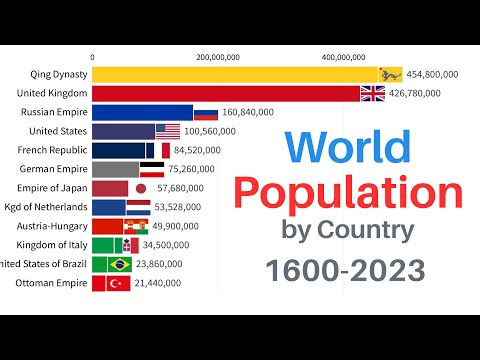
This video follows the top 15 countries or political units by population at any given year. It begins in the year 1600 and continues to the present, where more than 14 times the people now inhabit the planet.
Humanity has embarked on an unprecedented period of population growth over the past 400 years. Over the course of this demographic transition great changes have swept the planet with no government from 1600 remaining uninterrupted until the present.
Unfortunately, due to a lack of sources, many smaller realms and kingdoms have been excluded in earlier periods, especially Native American tribes, several Sub-Saharan African kingdoms, and the Aboriginal people of Oceania. This may mean early totals are a bit low. Following about 1800, the vast majority of the world is included in totals. The erratic changes on the bars are caused by border changes and the rise/fall of the various powers. Rather than tracking population in a static area, this visualization seeks to emphasize the changing nature of demographic power throughout history.
World Population by Country | 1600-2023
Top 20 Country Population History & Projection (1810-2100)
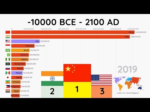
Top 15 Most Populated Countries (10000 BCE - 2100 AD)
Countries by Population 2023
Total Population by Country | Flags and country ranked by population | 180+ Country
World Population by Country 1600-2100 | History & Projection
Top 10 Most Populated Countries in the world 2024 (UPDATED)
Total Population by Country | World Population #Shorts
Countries by Population 2024
World Population By Country 2023 | And Percentage % To The World (End of October 2023)
Countries with the Most Christian Population in 2024 #religion #shorts
Most populated countries in the world | top 30 countries | Data Capsule
World Population by Country 1600 to 2100 | History & Projection
Muslim Population in the World 2024 (Country Wise)
World Population 1 - 2100
World Population - History & Projection (1820-2100)
World Population - History & Projection (10,000 BC-2100)
World Population by Country (1960-2020)
Population Size Comparison 2021 | Kxvin
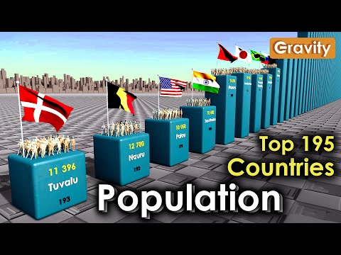
195 Countries by Population 2024
Top 10 countries with Largest Muslim population | MSA edits
Hindu Population in India from 1947 to 2023🤔😰|Hindu population in Pakistan in 1947 & in Banglade...
World Population 10000 BC - 2021 (adjusted to present day boundaries)
Most populated country in 2050???
Комментарии
 0:12:11
 0:05:08
 0:03:15
 0:09:29
 0:07:31
 0:12:01
 0:04:52
 0:00:58
 0:08:07
 0:09:34
 0:01:00
 0:02:21
 0:16:03
 0:02:12
 0:09:22
 0:08:03
 0:10:13
 0:04:18
 0:06:07
 0:11:58
 0:00:44
 0:00:25
 0:08:46
 0:00:19