filmov
tv
Power BI for Beginners || Sales Dashboard || Sales Report || Power Query || Data Visualization

Показать описание
Power BI Sales Report : Visualizing Sales Data
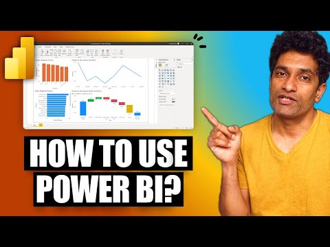
📈 In this Power BI sales report, I have created a comprehensive visualization of sales data to provide valuable insights into sales performance. The report utilizes various chart types, including a column chart, an area chart, a pie chart, a donut chart, and a map chart, to present the data in an easily understandable format.
The pie chart showcases the proportion of sales contributed by each region. The chart is divided into slices, where each slice represents a specific region. The size of each slice corresponds to the sales percentage of that region, making it simple to compare the sales distribution across regions.
Donut chart provides insights into the sales distribution across different market segments. Each segment is represented by a ring, with the width of the ring indicating the sales proportion. This visualization enables a quick understanding of the sales composition by segment.
Column chart presents the sales data categorized by sub-categories. Each column represents a sub-category, and the height of the column corresponds to the sales volume. This visualization helps identify the highest and lowest performing sub-categories.
The map chart visualizes the sales data geographically, presenting it on a map at the state level. The bubble on the map reflects the sales volume, allowing for easy identification of high-sales and low-sales states.
Area chart displays the sales trend over time, broken down by year, quarter, and month. It provides an overview of the sales performance across different time periods in the selected region.
By combining these various chart types, this Power BI sales report provides a comprehensive overview of sales performance. The visualizations aid in identifying sales patterns, understanding regional performance, comparing sales by category and segment, and evaluating sales over time.
How to Make Dashboard in power BI
Power BI mai dashboard kaise banate hai
#PowerBI #Demand #BestSalary #HighDemand #BusinessIntelligence #DAX #Functions #Measures #CalculatedColumns #AdvancedDAX #DAXFunctions#BestBITool #Highest #HighestSalary #BestNegotiation #Package #HighPackage #Visualizations #Reports #Dashboard #HighSalary #BI #HotSkill #MarketDemand
#power #data #dataanalytics #datascience #database #dashboard #exceltips #exceltricks #sale #powerquery
 0:12:32
 0:12:11
 0:23:03
 0:11:15
 8:59:42
 3:40:48
 3:02:18
 0:27:53
 0:01:04
 1:03:31
 0:05:12
 1:36:48
 0:27:43
 3:35:38
 0:20:11
 8:36:05
 0:12:43
 0:42:50
 0:12:50
 4:44:09
 8:24:31
 0:44:59
 0:15:20
 3:06:21