filmov
tv
How to make Dynamic 3D Cylinder Chart in Excel - PART 2 - Excel Tips and Tricks
Показать описание
Learn how to make dynamic 3D cylinder chart in Excel.
To create a cylindrical shape chart in Excel, first, select the data you want to include in the chart. Then, go to the "Insert" tab, choose the "3-D Cylinder" chart option from the Chart types, and Excel will generate a cylindrical shape chart for you. Similarly, to create a stack chart, select your data, go to the "Insert" tab, and choose the "Stacked Bar" chart type. A clustered cylinder chart in Excel combines the cylindrical shapes for different data series within clustered groups, offering a visual representation of data in both the vertical and horizontal dimensions. To create a stacked area chart in Excel, highlight the relevant data and choose the "Stacked Area" chart type from the "Insert" tab. For a dynamic shape in Excel, you can use shapes and link them to cells containing dynamic data. A cylinder column chart represents data using vertical cylindrical columns. The difference between a cylinder column and a square column lies in the shape of the columns used to represent the data. While a cylinder column has a cylindrical shape, a square column has a square shape. The two types of column charts you can create in Excel are clustered column charts, where columns are grouped side by side, and stacked column charts, where columns are stacked on top of one another to show the total value.
Here are the steps outline on the video.
Insert Chart
1) Ctrl+A
2) Insert ~ Charts ~ 3-D Stacked Column
3) Resize and reposition
4) Chart Design ~ Data ~ Switch Row / Column
5) Select Band 1 and 2 data
6) Ctrl + C
7) Select chart
8) Ctrl + V
9) Chart element (+)
10) Remove
a) Axes
b) Chart title
c) Gridlines
Cylindrical Bar Chart
1) Right-click any bar, Format Data Series...
2) Gap width = 40%
3) Column Shape = Cylinder
4) Right-click , 3-D Rotation...
5) X-Rotation = 0
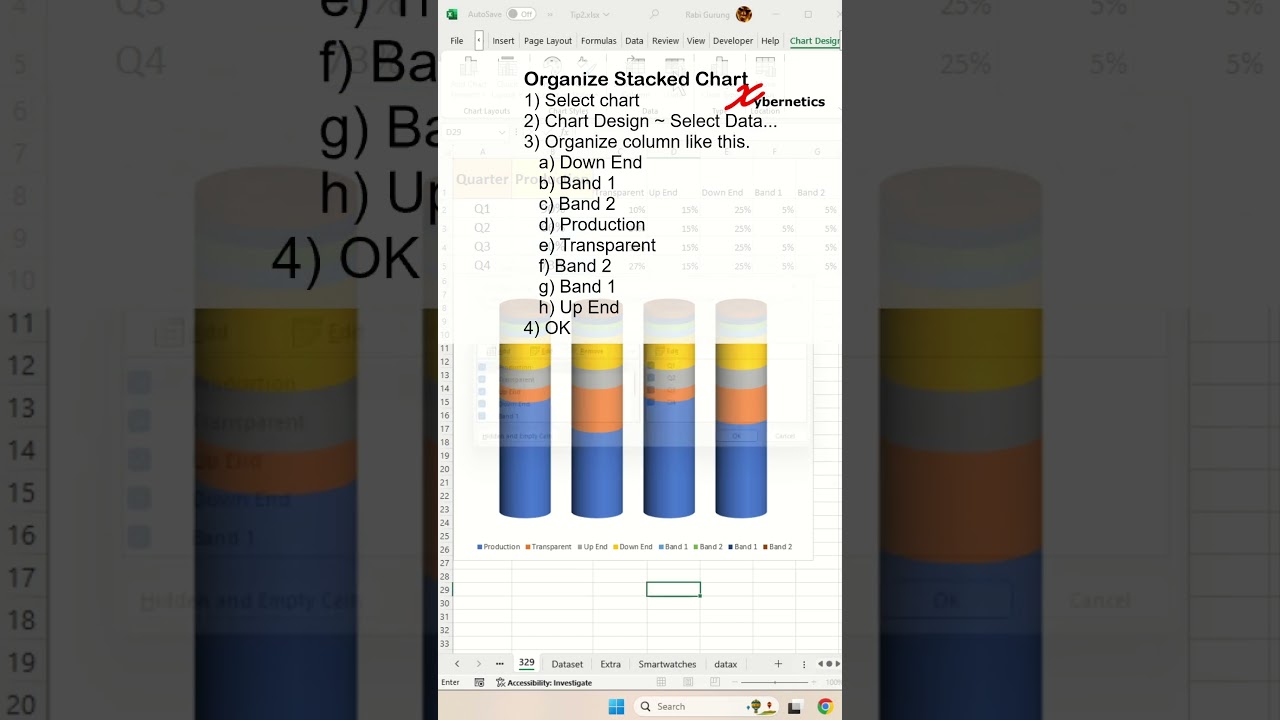
Organize Stacked Chart
1) Select chart
2) Chart Design ~ Select Data...
3) Organize column like this.
a) Down End
b) Band 1
c) Band 2
d) Production
e) Transparent
f) Band 2
g) Band 1
h) Up End
4) OK
Transparent Bar
1) Right-click, Format Data Series..
2) Fill and Line
3) Fill ~ Solid Fill
4) Transparency to 80%
Stacked Chart Color
1) Dark blue to green
2) Dark Red to white
3) Green to white
4) Blue to green
5) Yellow to white
Add Shadow
1) Select bottom bar
2) Right-click, Format Data Series..
3) Effects
4) Shadow
5) Distance 9pt
🔗🔗 LINKS TO SIMILIAR VIDEOS 🔗🔗
How to make Dynamic 3D Cylinder Chart in Excel - PART 1 - Excel Tip and Tricks
How to make Dynamic 3D Cylinder Chart in Excel - PART 2 - Excel Tip and Tricks
How to make Dynamic 3D Cylinder Chart in Excel - PART 3 - Excel Tip and Tricks
How to make Dynamic 3D Cylinder Chart in Excel - PART 3 - Excel Tip and Tricks - DETAIL EXPLANATION
#shorts #microsoft #excel #microsoft #tiktok #shortvideo #howto #fyp #google
To create a cylindrical shape chart in Excel, first, select the data you want to include in the chart. Then, go to the "Insert" tab, choose the "3-D Cylinder" chart option from the Chart types, and Excel will generate a cylindrical shape chart for you. Similarly, to create a stack chart, select your data, go to the "Insert" tab, and choose the "Stacked Bar" chart type. A clustered cylinder chart in Excel combines the cylindrical shapes for different data series within clustered groups, offering a visual representation of data in both the vertical and horizontal dimensions. To create a stacked area chart in Excel, highlight the relevant data and choose the "Stacked Area" chart type from the "Insert" tab. For a dynamic shape in Excel, you can use shapes and link them to cells containing dynamic data. A cylinder column chart represents data using vertical cylindrical columns. The difference between a cylinder column and a square column lies in the shape of the columns used to represent the data. While a cylinder column has a cylindrical shape, a square column has a square shape. The two types of column charts you can create in Excel are clustered column charts, where columns are grouped side by side, and stacked column charts, where columns are stacked on top of one another to show the total value.
Here are the steps outline on the video.
Insert Chart
1) Ctrl+A
2) Insert ~ Charts ~ 3-D Stacked Column
3) Resize and reposition
4) Chart Design ~ Data ~ Switch Row / Column
5) Select Band 1 and 2 data
6) Ctrl + C
7) Select chart
8) Ctrl + V
9) Chart element (+)
10) Remove
a) Axes
b) Chart title
c) Gridlines
Cylindrical Bar Chart
1) Right-click any bar, Format Data Series...
2) Gap width = 40%
3) Column Shape = Cylinder
4) Right-click , 3-D Rotation...
5) X-Rotation = 0
Organize Stacked Chart
1) Select chart
2) Chart Design ~ Select Data...
3) Organize column like this.
a) Down End
b) Band 1
c) Band 2
d) Production
e) Transparent
f) Band 2
g) Band 1
h) Up End
4) OK
Transparent Bar
1) Right-click, Format Data Series..
2) Fill and Line
3) Fill ~ Solid Fill
4) Transparency to 80%
Stacked Chart Color
1) Dark blue to green
2) Dark Red to white
3) Green to white
4) Blue to green
5) Yellow to white
Add Shadow
1) Select bottom bar
2) Right-click, Format Data Series..
3) Effects
4) Shadow
5) Distance 9pt
🔗🔗 LINKS TO SIMILIAR VIDEOS 🔗🔗
How to make Dynamic 3D Cylinder Chart in Excel - PART 1 - Excel Tip and Tricks
How to make Dynamic 3D Cylinder Chart in Excel - PART 2 - Excel Tip and Tricks
How to make Dynamic 3D Cylinder Chart in Excel - PART 3 - Excel Tip and Tricks
How to make Dynamic 3D Cylinder Chart in Excel - PART 3 - Excel Tip and Tricks - DETAIL EXPLANATION
#shorts #microsoft #excel #microsoft #tiktok #shortvideo #howto #fyp #google
 0:11:50
Create DYNAMIC 3D Routes | Google Earth Studio + After Effects 2023
 0:03:16
Create a dynamic 3D line wave art with optical illusion effect in Adobe Illustrator tutorial
 0:00:17
Cam Anim 3D - Dynamic camera movements in Blender 3D
 0:13:12
DYNAMIC 3D FLY-THROUGH Map Animation | Google Earth Studio + After Effects
 0:00:17
Wing | Dynamic Rig | Yeti Feathers | WIP
 0:10:06
Make 3D DYNAMIC Map Animations Like A Pro // Google Earth Studio + After Effects 2022
 0:07:14
Create A Dynamic 3D Text Animation In After Effects (No Plugins)
 0:00:33
India Ball Animation (dynamic paint for water simulation)
 0:01:08
Dynamic Paint + Ocean. Water collision without simulation in Blender.
 0:02:20
How to create 3d dynamic block in Autocad
 0:03:06
Create Dynamic 3D Text in After Effects | Adobe Video x @filmriot
 0:11:36
Dynamic Line Wave | Adobe Illustrator Tutorial
 0:02:11
Dynamic Block For Beginners - AutoCAD
 0:01:25
Dynamic 3D Pixel Art Particle Lighting
 0:00:37
Blender Hair Dynamic & Technique | 3D Animal Showreel
 0:15:27
Dynamic Cloth Logo Animation in Blender 3D - Blender 3D Tutorial
 0:03:27
AutoCAD - Creating a 3d dynamic block advanced
 0:01:14
Create dynamic Fur/Hair in Blender Tutorial!
 0:00:23
Dynamic paint in Blender!!  #blender
 0:09:53
Animating Doors and Windows with DYNAMIC COMPONENTS in SketchUp!
 0:03:28
Water Ripples in Blender 3.x [Dynamic Paint]
 0:02:01
AutoCAD creating a 3d dynamic block
 0:16:18
Create Dynamic Water Ripples With Geometry Nodes And This Crazy Trick: Blender 3.6
 0:05:23
Dynamic Colors with this SECRET Node Trick (Fast and Easy Blender Tutorial)
Комментарии