filmov
tv
Highlight Highest / Lowest AUTOMATICALLY using DAX // Beginners Guide to Power BI in 2021
Показать описание
Get Demo Files here
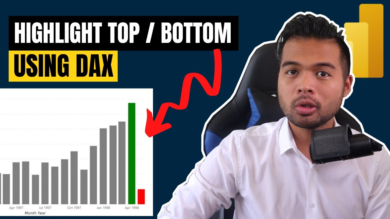
In this video we're going to go through how you can dynamically highlight the highest / lowest values from your charts using DAX
-
🚩 Support us to get perks such as demo files, early access and more!
MY FAVOURITE POWER BI BOOKS
MY GEAR
GET IN TOUCH
🌍 WHO IS SOLUTIONS ABROAD
Hi, my name is Fernan, the one-man band of Solutions Abroad. I work as a Data Scientist based in London, UK and have over 6 years of experience working in Business Intelligence. Solutions Abroad these days is dedicated to teaching the ins and outs of Power BI, through the power of YouTube.
If you want to learn more, I’ve conveniently created playlists to help you find the right topic for you.
🐎 First, watch this video about how a typical Power BI workflow looks like
🗺 Learn DAX to extend your Power BI calculations
📆 Stay up-to-date on all the features Power BI releases monthly
🧪 Get certified as a Microsoft Data Analyst Associate
💡 Learn Power BI Features to improve your dashboards
📊 WHAT IS POWER BI?
Power BI is a business analytics tool by Microsoft. It creates a working environment suited for normal users, meaning tasks such as data extraction, cleansing, analysis and storytelling; these are made easily-accessible to citizen-users, and extendable for technical users. At face value it provides visually-stunning, interactive dashboards, but it’s built on top of so much more.
🔻 Get started with Power BI Desktop for FREE
#PowerBI #DataAnalytics #BusinessIntelligence
Комментарии