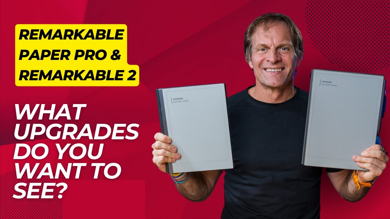
What Upgrades Do You Want to See on the reMarkable Paper Pro and reMarkable 2?
preview_player
Показать описание
Welcome back to the MorningCoach® YouTube channel! I'm your host, JB Glossinger. Today, we're having an exciting and interactive conversation about the future of the reMarkable Paper Pro and reMarkable 2.

This episode discusses the potential improvements and features we'd love to see in these remarkable devices. We've got much to cover, from enhancing the light brightness and offering alternative nib options to improving software linking and searching capabilities. Plus, we want your input! Please share your ideas in the comments because a little birdie told me that the folks at reMarkable are watching and listening. So, let's get started and shape the future of the reMarkable together. Grab your favorite beverage, and let's jump in!
_______________________________________________________________________

Let’s Connect:

My other YouTube channels:

Join this channel to get access to the perks:

JB Glossinger, MBA, Ph.D., is widely beloved as the MorningCoach®, with a daily podcast that has been downloaded over 40 million times. A sought-after motivational keynote speaker and author of 4 books, JB is also a Mastermind group leader and one of the most sought-after coaches in the world.

He holds advanced degrees in business and metaphysics but credits his street education—from black eyes to near bankruptcy—with providing the life-changing lessons that inspired the keys to personal transformation he shares with audiences, coaching clients, and readers worldwide.

Disclaimers: all opinions are my own, and sponsors are acknowledged. Not financial advice, for entertainment purposes only.——————
Рекомендации по теме
Комментарии
Автор

Here are my points:
- display gray tones correctly and do not remove them, as is currently the case
- make it brighter like in the hack (I agree with you 100%)
- a softer nib could also eliminate the clicking when writing - that's a real DISTRACTION
- add bookmarks so you can easily jump within a document (tags are pointless here as you have to do too many gestures just to jump from one page to another). For older os versions this has already been programmed in hacks, so why can't the developers do it?
- add links - this can be programmed along with the bookmarks, but is not a replacement for them
- add support for custom templates without the need for hacks
- add split screen - another function which was done in hacks but not officially

I am fully convinced that reMarkable should be as simple and distraction-free as possible, but distraction-free does not mean that you should not support fast workflows because you are afraid of too many features. I find it very distracting when you can only do things - like jump between 2 pages of a notebook - with many steps and full concentration on the GUI.
If there is a fear of overwhelming users, then you can put it all behind the “Advanced” button so that nobody who doesn't want to read manuals and just needs a simple sheet of paper comes into contact with it.
But the others don't have to suffer from the fact that many people don't understand RTFM

juergenwoelfel
Автор

In order of priority

1. Links from note pages to other document and notebook locations. Very helpful for organization among and within notebooks. And enables immediate movement between related documents and notes.

2. Searchable handwriting. Avoids the need to explicitly tag every single thing you may need to search h.

3. Split screen mode, both to read two pages at once for small paper size docs, and secondly also to have a notebook open while you read a PDF book say.

hanideal
Автор

- writing: some way to create a table of contents for each notebook.
- reading: stronger front light. A way to create embedded notes. a way to output highlights with notes.

sherrywang
Автор

It's a coloured paper pro, so copy paste pictures should definitely on the list of improvements.🎉

yihanzhang
Автор

Thank you for sharing 👍🏼👍🏼. Stay safe healthy and happy ✝️🇺🇸🦬🖖

Spokenfan
Автор

Things I want (in order of priority):
1) Fully customizable toolbar. I use way more than two pens in my workflow, and I'd like to be able to add as many as I want and to rearrange anything I want to any position.
2) Copy-paste text from PDF/EPUB to paste into another page. I realize DRM doesn't always permit this, but if I am able, I would like to be able to move text for, say, a school assignment to another page so I don't need to flip back and forth.
3) Sync files directly to third-party cloud services. I am a writer who works out of a Linux desktop environment, and I hate the idea of locking myself into an ecosystem. Color is a big part of my workflow, and the RMPP delivers on that front, so I would like reMarkable to "get out of my way" as their modus operandi suggests, and allow me alternate options for cloud synchronization. This leads me to my fourth point:
4) Native Linux application. I don't care what installation method I need to use, and I realize for many this isn't a high priority, but I would like a natively compiled Linux release of the otherwise excellent reMarkable app so I can keep from continuously exporting file versions to Google Drive. Considering reMarkable thought Linux was a good framework for their devices, I don't feel like this is really a big ask.
5) Highlighter only mode for eraser. I'm familiar with the layer workaround for erasing highlighter only, but it interferes with my workflow. I'd like a toggle option for the eraser tool to erase highlighter only.
6) Supernote-style notebook Table of Contents system. One of the handful of things that makes Supernote's software more appealing. But again, color is more important to my workflow, so here I am with my RMPP. Still, I'd like to see more capable software, and this feature would go a long way towards helping me organize the scenes I write.
7) Searchable handwriting. One of the few features I miss from Samsung Notes when I used to use that for writing. Writing on the RMPP feels way better than any paper-like tablet experience.
8) Style editor. If I write something in blue and I decide I want it thinner and in green, I'd like to change that without having to rewrite.
9) Functional in-document links for EPUB/PDF. If a Table of Contents page links to a chapter, I would like to be able to tap on that link and be transported to that location in the file.
10) Table of Contents access for EPUB/PDF. If the file has that data available, I'd like easy access to it.
11) Landscape mode for EPUB/PDF. I need those multiple columns and wide pages.
12) Viewing images and inserting them into notebooks. I don't do it much, but I do it occasionally. You have that beautiful, vibrant Gallery 3 screen, and I want to see you using it!

moxenial
Автор

RPP for me has been great. I use mainly as a note taker and love being able to review and highlight notes. Refresh does not bother me.
-- Softer nibs would be the ticket
-- Adjustable line width (ability to hold down on the 3 widths and select default widths). The smallest is way to small with some tools.
-- Get rid of subscription costs. I tried without the subscription and the user experience wasn't near what it is when using.
-- Ability to to work directly out of your google or microsoft one drives
-- PNG and JPEG support

clintlafont
Автор

I am getting my rM Paper Pro later this week, so this might be already a focus point of the product. But one thing that pulled me a way from organizing and journaling on the Onyx BOOX device is the inability for it to efficiently recognize palm rejections. I have disabled the swipe and gestures on BOOX, and it will continue to bring down the notification menu and send me back out to the main menu, because I'm a lefty (southpaw) and rest my hand above the writing area. This means the left margin and the top margin/header is most of the time in contact with my palm/hand, and this causes me to lose immersion when I'm constantly getting popups/slide-downs, or thrown out to the main menu. I want this device to be my main means of taking notes, and allow me to not have to use paper. So hopefully (fingers crossed) the rM Paper Pro behaves properly with me. Yes, I could re-learn how to write, in a normal right-handed fashion. But after 50+ years of writing, I feel the device should conform to my needs not vice versa.

Stretch
Автор

1. Being able to link to notebooks and PDFs in other notebooks.
2. Being able to get to recent documents easily.
3. Improve search

shamekaharris
Автор

Better experience for typing. More formatting options, word or google integration. The type folio is amazing, honestly one of the best…but the lack of formatting and linking/integration options make the type folio “unnecessary” or even irrelevant.

rgsr
Автор

I’d like to have some simple shapes like square, circle, triangle, arrows in addition to the straight lines!

ptills
Автор

Improving the light and linking would be wonderful. I have both the A5X and A6X2 and only use my RMPP now

Rsmin
Автор

Hi thank for yout content :
A great new feature in my opinion : being able to select a caligraphy text and edit color at least or better, able to edit style too (// police and color on computer writting)
--> a powerfull way to improve structure and the way we note things after having noting them
2 importants things to solve at least :
- Being able to select text on the pdfs (on the tablet, and on the cloud software)
- the pdf who are modified (adding text on adobe on it), appear virgin once you put it on the cloud...this need to be solved

Teckelnainahuri
Автор

Header, table of contents within a notebook, tag chain, stars, link the to-do list back to a notebook, notifications., and the ability to customize out sleep screens up to 5-10 options)

telockett
Автор

I use the fineliner medium both on the pro and on the rm2. Would really like more brush options and also a softer nib! Also, as a pen guy: a Sailor nib!

jips
Автор

I am thinking of returning my RPP device only because the reading part is very behind compared to Kindle Scribe or even Supernote. I wish we could export highlights and also add notes to those highlights like we can do in Scribe and supernote. And also dictionaries like KScribe. Another great feature could be adding Rtl languages in keyboard. I would love to keep this device if they can manage adding these features in their new updates, because overall the device is fantastic, especially this 11.8 inch screen.

peymandaei
Автор

I would like the email app a little more robust as far as saving contact. I would also like the ability to import a .jpg or such into a notebook. I would like the light a little bit lighter your right. And maybe a way to automatically adjust lighting.

cloker
Автор

If possible, tapping the Paper Pro's Marker to switch tools would be really nice!

UnorthodoxWriter
Автор

Ability to do everything in landscape e.g home etc as disorientating to need to flip it around.

Oh export in windows friendly docs for typed text.

richardparr
Автор

I just need linking, the ability to create headings, keywords, and stars like on my Supernote.

davidpaxton