filmov
tv
Piet Mondrian: for a correct interpretation

Показать описание
The interpretation of an abstract work of art is, for the viewer, more complex and less intuitive than its figurative counterpart, so much so that if we look at a portrait, thanks also to the information drawn from its title, it is possible to understand both the identity of the sitter and his or her relationship with the artist, which is often the reason behind the creation of the masterpiece itself...
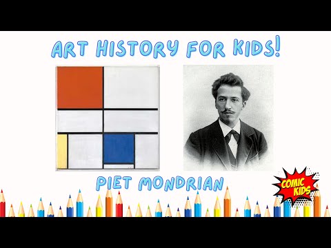
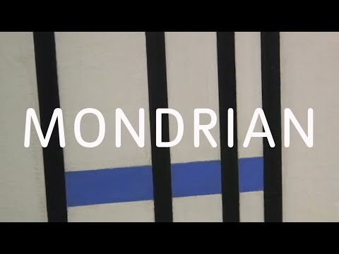
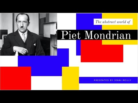
For the viewer, figuring out what an abstract piece of art is about is harder and less obvious than figuring out what a figurative piece of art is about. In fact, if we look at a portrait, we can figure out both the identity of the effigy and its relationship with the artist, which is often why the artist made the masterpiece in the first place. On the other hand, if you want to fully understand and appreciate an abstract painting, you should document and study it more. This will help you understand its place in art history and the creative process that went into making it, which is the result of the artist's personal view of the world. Analysis of Piet Mondrian's Composition with Red, Yellow, and Blue (1929), which many people find "blasphemous" because it is just a bunch of colored geometric shapes, shows what has just been said. In reality, the 1929 masterpiece tells a much deeper story. It is the result of a linguistic quest that the Dutch master began around 1907. At that time, he was drawn to the spiritual discipline of Theosophy and adopted its philosophical principles. He wanted to unite the universal and the individual, the inner and the outer, by making compositions that were becoming more essential and balanced in terms of color and form. In fact, the popular style of Composition with Red, Yellow, and Blue was created between the two world wars. It has a careful arrangement of vertical and horizontal lines on the support to create square and rectangular backgrounds of the same size. The three primary colors each have a specific meaning: yellow is related to solar energy, red represents the union of light and space, and blue is the color of the sky. In this case, the artist's goal of a universal balance is well shown by the large white square, which is balanced at the top, to the right of the support, by the presence of the colored geometric shapes mentioned above, which are set up in the different and opposite corners of the canvas. After this short explanation, you should be able to understand the "related" works by the same master, which were made roughly between the 1920s and 1930s. Later, in works like Tableau I: Lozenge with Four Lines and Gray, the master's geometric style changes to focus more on exploring the potential of the lozenge, a diamond-shaped figure. This figure shifts the more traditional orientation of the canvas, making the lines within it look like they go on forever. In the 1940s, the artist was captivated by the energy of New York City, a place where the rhythm of jazz music was felt very strongly. This was the final phase of his work, which is marked by the asymmetrical placement of brightly colored squares within yellow lines. This was an attempt to capture the rhythm of the city, just like in Broadway Boogie-Woogie (1942-43). Also from this time period is the 1941 painting "New York City 1," which has recently gotten a lot of media attention because it has been hanging upside down at the Kunstsammlung Nordrhein-Westfalen in Düsseldorf, Germany, for over 75 years. This find, which is signed by the Italian artist Francesco Visalli, shows that the above thesis is true: it is still harder and more complicated to understand an abstract painting than it is to understand a realistic one...
 0:00:59
 0:05:30
 0:02:49
 0:04:13
 0:03:53
 0:02:16
 0:17:29
 0:14:38
![[ NEW ]](https://i.ytimg.com/vi/xC8ftNAQhdw/hqdefault.jpg) 0:59:56
0:59:56
 0:04:34
 0:00:44
 0:01:29
 0:01:14
 0:01:30
 0:01:30
 0:01:39
 0:01:38
 0:01:14
 0:01:16
 0:11:42
 0:04:33
 0:00:25
 0:06:03
 0:57:16