filmov
tv
CSS Image Gallery Tutorial - Responsive Gallery with HTML and CSS Flexbox
Показать описание
How to Create CSS Image Gallery Tutorial - Responsive Gallery with HTML and CSS Flexbox | Youtube Tutorial
Creating a Responsive Image gallery using CSS flexbox is easy and straightforward. Of course, there are plenty of ways to create an Image gallery using CSS, like using the CSS floats, CSS3 column module or by using jquery or javascript. However, we are going to use CSS3 display property set to flex to create our awesome photo gallery. We will not be using a single line of javascript or jquery to create this responsive Image gallery. No bootstrap or any other CSS framework will be used to create our photo gallery.
WHAT WILL YOU LEARN?
Here's how we will construct the structure for our HTML5 and CSS3 responsive Image gallery. HTML5 section element will work as the container for the Photo gallery and it will contain a figure element which will represent an individual image gallery Item which will further contain one image element for the gallery Image and one figcaption element for the image caption. You can write your image descriptions or caption inside the HTML5 figcaption.
After properly structuring your image gallery using HTML5. I will show you how to style your image gallery using CSS properties to make it beautiful and responsive. Making our HTML image gallery responsive is much easier when we are using the CSS3 flexbox module with the combination of media queries.
This will be a mobile-first image gallery where we will create this for the mobile and small screen devices first. After that, by utilizing the CSS media queries we will create few media queries rules to make our photo gallery responsive for the tablet, desktop and laptop devices. I will be using the three different media query breakpoints where I want my Image gallery to resize based on these different breakpoints.
===============NAVIGATE TO QUICK PARTS ===============
1:20 HTML Structure for Responsive Image Gallery
4:38 CSS Styling for your Image Gallery
=====================See working Demo==============
==================================================
If you have any questions, just comment below in comment section. I will try to respond as soon as possible.
Like, share and comment!
Thanks
============Useful Tutorials=============
Responsive Image Gallery using HTML5 and CSS3 - Part - 1
Responsive Image Gallery Using HTML5 and CSS3 - Part - 2
Distributing images evenly in a fluid container
Creating CSS3 Tooltip without using jquery or javascript
Styling placeholder text using css3
Creating three column responsive layout
How to create simple css3 preloading animation
************************CONTACT and RESOURCES*************
Find all the source codes here:
Follow on Twitter
Add on Facebook
Like Page on Facebook
 0:05:38
How to create a CSS image gallery in 5 minutes! 📷
 0:04:05
W3Schools CSS Image Gallery Tutorial
 0:20:28
Create Responsive Image Gallery Using HTML and CSS
 0:00:25
Image Gallery in HTML/CSS #shorts #youtubeshorts #viral #html
 0:39:37
CSS Grid Responsive Image Gallery Tutorial
 0:05:26
Responsive Image Gallery with HTML & CSS (Flexbox)
 0:18:35
How To Make Image Gallery Using HTML, CSS & JavaScript | Create Image Gallery Step by Step
 0:06:54
Responsive Image Gallery Using Only CSS Grid
 0:00:10
Awesome Photo Gallery using HTML and CSS
 0:11:21
How To Make Responsive Image Gallery With HTML CSS JS | Lightbox Image Gallery Design
 0:06:39
How To Create a Responsive Image Grid (Masonry Layout) with HTML and CSS - Flexbox
 0:00:12
Image Gallery HTML CSS JS #programmingwithkrishna #html #css #cssanimation #javatutorial #python #js
 0:11:13
how to create responsive image gallery using html and css
 0:00:11
I have Created Image Slider using Html/Css/Js❤️
 0:00:24
Learn CSS Grid Column and CSS Grid Row in 24 Seconds
 0:16:49
photo gallery html and css | make a photo gallery using html & css only | am webtech
 0:00:06
Image Slider (using Gsap) #css #coding #gradient #gradienteffect #Website
 0:08:03
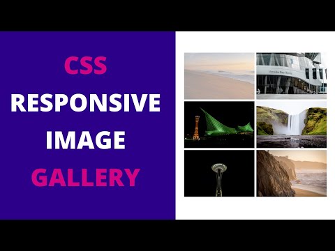
Responsive Image Gallery using HTML CSS | CSS Image Gallery
 0:02:32
Expandable Image Gallery using HTML and CSS | Web Dev Wizard
 0:10:49
How to Create an Image Grid Gallery - HTML, CSS Web Design Tutorial
 0:00:12
Image Gallery HTML CSS JS #programmingwithkrishna #html #css #cssanimation #js #javatutorial #python
 0:07:11
Responsive Image Gallery with CSS Grid | CSS image grid gallery | HTML CSS image grid gallery
 0:04:12
Responsive Image Gallery Using Flexbox | Simple Image gallery | Beginners Tutorial
 0:07:41
HTML and CSS Project Tutorial: Pure CSS Image Slider
Комментарии