filmov
tv
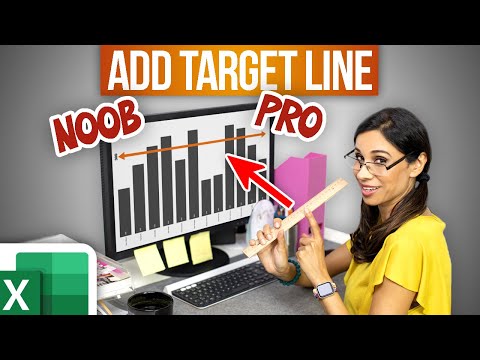
How to Create Dynamic Target Line in Excel Chart (Noob vs Pro Trick)

Показать описание
Transform your Excel charts with this simple guide on adding dynamic target lines. Perfect for enhancing presentations and data analysis!
🔍 What You'll Learn:
▪️ Easy Steps to Add a Target Line: Discover a straightforward method to include a target line in column charts.
▪️ Making Your Target Line Dynamic: Learn how to automate your target line adjustments with every data update.
▪️ Bar Chart Hack: Find out how to apply these techniques to bar charts for a professional and sleek look.
🛠️ Key Features Explored:
▪️ Using Excel tables for automatic updates.
▪️ Adjusting chart types and styles for better visualization.
▪️ Customizing data labels and chart orientations for clarity.
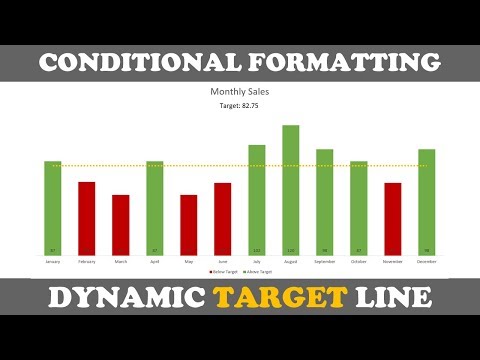
A target line or average line is a powerful visual that allows you to compare how actual data compares to their goal or budget. Visualizing such a target line in a dynamic way in a Microsoft Excel chart is not that simple. Specially adding a target line to a bar chart. In this video I'll show you a super easy way to create such dynamic target lines for both a column chart and a bar chart.
00:00 How to Add a Target Line to an Excel Chart
00:15 How NOT To Do It
01:02 Add Target Line to Column Chart in Excel
04:55 Add Target Line to Bar Chart in Excel
🎬 LINKS to related videos:
🚩Let’s connect on social:
This description contains affiliate links, which means at no additional cost to you, we will receive a small commission if you make a purchase using the links. This helps support the channel and allows us to continue to make videos like this. Thank you for your support!
#Excel
 0:06:54
How to Create Dynamic Target Line in Excel Chart (Noob vs Pro Trick)
 0:12:12
How to Create a Dynamic TARGET LINE in Excel Chart
 0:20:05
Transaction control Transformation in Informatica | How to create dynamic file in target |
 0:10:15
Effortlessly Create Dynamic Charts in Excel: New Feature Alert!
 0:15:59
Visualization HACK you wish you knew before... DYNAMIC BENCHMARK RANGE in Power BI
 0:02:50
Adding dynamic Target or Forecast values using Parameter in Tableau
 0:11:06
How to Create a Dynamic TARGET LINE in Excel CHART using SCROLL BAR
 0:13:57
Dynamic Chart: Target Vs Actual Sales
 0:01:24
How to Add a Target Line to a Bar Chart in Power BI
 0:09:35
Excel Actual Vs Target Chart - Conditional Formatting & Dynamic Target | FREE Download
 0:12:49
Budget Vs Actual - Dynamic Chart | Plan Vs Actual | Target Vs Actual
 0:08:38
Dynamic Targets in Power Bi Column Chart
 0:01:00
DYNAMIC TARGETS in Power BI #Shorts
 0:30:57
IICS Informatica Tutorial : Dynamic Mapping Task : Use Source ,Target as Parameter
 0:07:37
➕Add a Dynamic Target Line to A Chart In Excel 🎯
 0:13:47
Beautiful Progressive Doughnut Chart with Dynamic Target Line in Excel (Step by Step Tutorial)
 0:04:35
Dynamic Actual vs Target Chart in Google sheet
 0:03:11
How to add a Target Line in Excel Graph | Create A Dynamic Target Line In MS Excel Charts |
 0:16:35
HOW TO CREATE A DYNAMIC TARGET LINE IN MS EXCEL (TAMIL) | Kallanai YT
 0:00:31
How to Create a Dynamic Target Line in Excel 🎯 | Tricks & Tips
 0:14:57
Dynamic file generation in informatica
 0:16:49
Informatica Vs SSIS : Dynamic Target File Creation
 0:05:58
Dynamic Chart-Target Vs Actual in Excel
 0:11:04
Set Dynamic Targets For All Hierarchical Levels in Power BI - Advance Power BI
Комментарии