filmov
tv
Stock Analysis Tutorial - Advanced Beginner R Programming - Charting with ggplot2 (Part 5)

Показать описание
This is a beginner data science tutorial where we will build an interactive stock analysis dashboard using RStudio, the R programming language, and the 'Shiny' dashboard package. This tutorial covers web scraping, dynamically downloading stock data, basic r programming and data cleaning, plotting with ggplot2, and coding an interactive dashboard in Shiny.
In this video we create a historical price chart, an industry bar chart, and a performance bar chart.
________
Download RStudio:
________
Tidyverse:
________
Basic Data Manipulation in R:
Pipe operator shortcut:
ctrl + shift + m
dplyr:
- filter()
- select()
- mutate()
- group_by() & summarize()
- left_join()
tidyr:
- spread()
- gather()
________
Basic R videos:
_______
Social
Twitter:
@Matt_C_137
GitHub:
@MattC137
Email:
The Only Technical Analysis Video You Will Ever Need... (Full Course: Beginner To Advanced)
How I Pick My Stocks: Investing For Beginners
The ONLY Candlestick Pattern Guide You'll EVER NEED
ChatGPT Trading Strategy Made 19527% Profit ( FULL TUTORIAL )
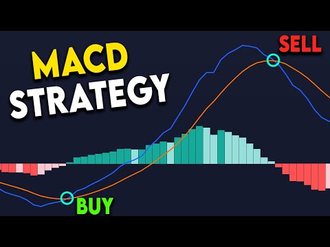
BEST MACD Trading Strategy [86% Win Rate]
Stock Analysis Tutorial - Advanced Beginner R programming - Scraping the S&P 500 Stock List (Par...
Advanced Market Structure Course (Full Tutorial)
Ultimate Chart Patterns Trading Course (EXPERT INSTANTLY)
Rudra Advance Trading Course | Master Advanced Stock Market Strategies|SMC, AI Institutional Trading
Simplifying Advanced Market Structure in 20 Minutes | Forex Trading Tutorial
Fundamentals of Stock Analysis | A step-by-step process to analyse stocks #StockMarket
Automated Technical Analysis: Tutorial
Trading for Beginners Part 1 - FULL TRADING COURSE TUTORIAL
How To Use TradingView For Beginners (FULL Tutorial 2025)
Robinhood Technical Indicators + Advanced Charts Tutorial (NEW)
Trading Comps Valuation Tutorial From Former JP Morgan Investment Banker! (Excel Template Included)
Advanced DCF Tutorial WITH EXCEL SHORTCUTS! (Ex J.P. Morgan Investment Banking Analyst)
Market Structure Deep Dive (Full tutorial for Beginner and Advanced)
RSI Indicator in Live #StockMarket | Technical Analysis for Beginners
Stock Analysis Tutorial - Advanced Beginner R programming - Getting Stock Price Data (Part 2)
Tutorial On Gann Box and Gann Square Trading Strategy | Gann Indicators
StockwarePro Advanced Video Tutorial
MACD INDICATOR EXPLAINED (Trade with the trend)
The Stock Screener Explained: Tutorial
Комментарии
 1:17:35
 0:13:33
 0:11:45
 0:08:12
 0:07:06
 0:12:17
 0:14:27
 0:38:15
 0:05:08
 0:20:45
 0:22:04
 0:10:25
 2:26:40
 0:39:16
 0:09:25
 0:46:31
 1:36:41
 1:07:12
 0:16:51
 0:23:46
 0:07:42
 0:29:10
 0:05:04
 0:20:06