filmov
tv
COVID-19 2021Jun24 update. Final COVID19 video, I’ve retired! (Data-viz source code now open-source)

Показать описание
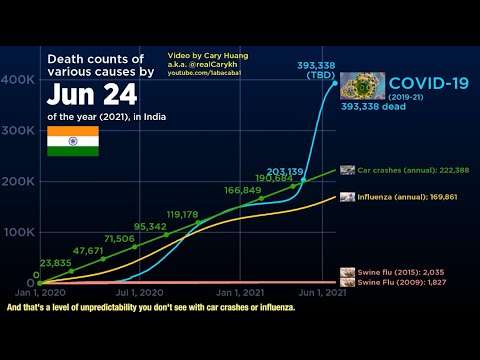
COVID-19 is still ravaging many countries like Brazil, Russia, and Colombia, even though it has subsided in countries with high vaccination rates like the US. I'm ending this series because
1) I've got a lot of other projects on my plate, including working towards my Masters' Degree
2) These videos aren't monetized, which wasn't a problem at first, because I made them inform the public about the state of the pandemic! But after 15 of these videos each taking 2-7 days to work on, it's getting harder to justify pausing other work to do these instead.
3) I don't think I'm the most qualified person to make statements about the state of the pandemic. National governments are probably better equipped to inform the general public than me. Also, I want to hand the mic to better experts on COVID-19, listed below!
As Som Jio pointed out, information about India's COVID-19 cases/deaths may be entirely incorrect, due to vastly different levels in testing. Kerala may have just appeared to have the highest concentration of COVID-19 cases because they tested the most, but they actually had an oxygen surplus and many fewer deaths than other states.
 0:22:51
COVID-19 2021Jun24 update. Final COVID19 video, I’ve retired! (Data-viz source code now open-source)...
 0:00:23
Not COVID-19? Check For H1N1, Say Doctors In Mumbai
 0:01:09
Covid-19: 9,180 new cases, highest daily figure since pandemic began
 0:03:58
Worldwide Coronavirus Recovered Cases Timeline Bar | 19th June 2021| COVID-19 Latest Update Graph
 0:06:21
Redoing COVID-19 data-vizzes (January 20, 2021 update)
 0:04:19
Worldwide Coronavirus Daily Confirmed Cases Timeline Bar 11th June 2021 COVID-19 Latest Update Graph
 0:03:59
(October 13, 2020 update) COVID-19 vs other 2000s epidemics
 0:15:37
COVID-19 bubbles for every country (Nov 6, 2020 update)
 0:22:52
Covid 19: A Chinese Bioweapon? | Can China Hide Behind Excuses Now?
 0:05:48
Monkeypox Outbreak. Monkeypox vs Smallpox vs COVID-19
 0:01:21
COVID's dangerous 'Delta variant' enters Australia
 0:20:04
Qu'est ce que la COVID-19? Explication simple- Epidémiologie, pathophysiologie et diagnostique...
 0:14:30
BTS coding the 'Sounds of Coronavirus' video (14 hours x60 speed)
 0:03:01
Coronavirus Vs flu and other pandemics of 21st century (data by abacaba)
 0:08:21
Coronavirus data from worldometers May 24, 2021
 0:01:00
Double jab offers 'real prospect' of travel from UK says Boris Johnson
 0:09:14
COVID’s Dangerous Delta Variant Enters Australia
 0:14:56
Mon. 10/04 - Thor's Antiviral COVID-19 Pill & Sexist Suitcases
 0:02:45
Covid 19 Death toll around the world | Death history
 0:11:51
Someone got to the front page of reddit twice with my Abacaba dataset! Yay? (BORING RAMBLE)
 0:03:04
COVID-19 Total Deaths - Death Data Visualization for December 31th, 2021 (Fork from Abacaba)
 0:06:59
Puntata 29/06/2021
 0:02:01
Protesta contro Bolsonaro, indagato per una partita di vaccini
 0:03:00
COVID still kills more Americans than guns car crashes and flu combined
Комментарии