filmov
tv
14- CSS Media Quries Tutorial - Learn CSS Media Quries - How to Make Responsive Website in Urdu

Показать описание
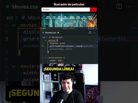
In this CSS Media Queries tutorial,
you'll learn how to make your website responsive and adaptive to various screen sizes using CSS Media Queries.
We'll explore the fundamentals of media queries, breakpoints.
If you are a beginner or looking to enhance your CSS skills, this tutorial has got you covered!
📌 **What You Will Learn:**
1. **Understanding the CSS Media Query:** What it is and how it works.
2. **Break Points:** How to float elements left or right.
3. **Practical Examples:** Real-world scenarios and examples.
✅ **Who Should Attend?**
- Students of web development
- Anyone interested to Learn CSS
📝 **Prerequisites:**
Fresher can join this course.
👨💻 **Github Repo:**
🔔 **Follow Us on Social Media:**
Like, share, and subscribe for more exciting content.
💬 **Comments & Suggestions:**
Leave a comment or suggestion below; we value your feedback!
👇 **Resources and Additional Materials:**
Download the source code and related materials from the link above.
Happy Learning! 🚀
#CSSMediaQueries #ResponsiveWebsite #WebDevelopment #CSSTutorial #WebDesign #MediaQueriesBreakpoints
 0:12:03
 0:07:33
 0:12:13
 1:26:14
 0:27:03
 0:06:53
 0:14:13
 0:14:11
 0:14:47
 0:32:55
 0:00:43
 0:15:00
 0:00:36
 0:03:34
 0:14:11
 0:15:26
 0:14:56
 0:04:55
 0:13:10
 0:16:56
 0:14:50
 0:06:06
 0:00:41
 0:09:41