filmov
tv
MICROSOFT NEW LOGO - NEW LOOK VIDEO !
Показать описание
Microsoft Unveils a New Look!
In advance of one of the most significant waves of product launches in Microsoft's history, today we are unveiling a new logo for the company.
It's been 25 years since we've updated the Microsoft logo and now is the perfect time for a change. This is an incredibly exciting year for Microsoft as we prepare to release new versions of nearly all of our products. From Windows 8 to Windows Phone 8 to Xbox services to the next version of Office, you will see a common look and feel across these products providing a familiar and seamless experience on PCs, phones, tablets and TVs. This wave of new releases is not only a reimagining of our most popular products, but also represents a new era for Microsoft, so our logo should evolve to visually accentuate this new beginning.
The Microsoft brand is about much more than logos or product names. We are lucky to play a role in the lives of more than a billion people every day. The ways people experience our products are our most important "brand impressions". That's why the new Microsoft logo takes its inspiration from our product design principles while drawing upon the heritage of our brand values, fonts and colors.
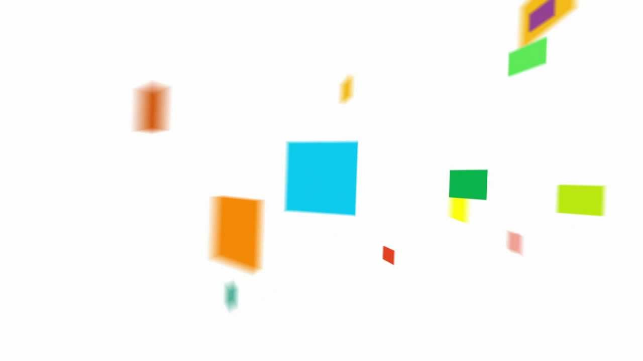
The logo has two components: the logotype and the symbol. For the logotype, we are using the Segoe font which is the same font we use in our products as well as our marketing communications. The symbol is important in a world of digital motion (as demonstrated in the video above.) The symbol's squares of color are intended to express the company's diverse portfolio of products.
We're excited about the new logo, but more importantly about this new era in which we're reimagining how our products can help people and businesses throughout the world realize their full potential.
Posted by Jeff Hansen
General Manager, Brand Strategy, Microsoft
MICROSOFT NEW LOGO - NEW LOOK VIDEO ! share:)
In advance of one of the most significant waves of product launches in Microsoft's history, today we are unveiling a new logo for the company.
It's been 25 years since we've updated the Microsoft logo and now is the perfect time for a change. This is an incredibly exciting year for Microsoft as we prepare to release new versions of nearly all of our products. From Windows 8 to Windows Phone 8 to Xbox services to the next version of Office, you will see a common look and feel across these products providing a familiar and seamless experience on PCs, phones, tablets and TVs. This wave of new releases is not only a reimagining of our most popular products, but also represents a new era for Microsoft, so our logo should evolve to visually accentuate this new beginning.
The Microsoft brand is about much more than logos or product names. We are lucky to play a role in the lives of more than a billion people every day. The ways people experience our products are our most important "brand impressions". That's why the new Microsoft logo takes its inspiration from our product design principles while drawing upon the heritage of our brand values, fonts and colors.
The logo has two components: the logotype and the symbol. For the logotype, we are using the Segoe font which is the same font we use in our products as well as our marketing communications. The symbol is important in a world of digital motion (as demonstrated in the video above.) The symbol's squares of color are intended to express the company's diverse portfolio of products.
We're excited about the new logo, but more importantly about this new era in which we're reimagining how our products can help people and businesses throughout the world realize their full potential.
Posted by Jeff Hansen
General Manager, Brand Strategy, Microsoft
MICROSOFT NEW LOGO - NEW LOOK VIDEO ! share:)
 0:00:05
Microsoft logo
 0:10:29
Microsoft New Logo New Look Video Effects (Sponsored By Preview 2 Effects)
 0:00:31
Microsoft's New Apple Style Logo?
 0:00:27
Microsoft Logo
 0:00:34
Microsoft unveils a new look (Reversed/Backwards)
 0:08:15
Microsoft New Logo New Look Video IL Vocodex Effects
 0:00:11
Microsoft Edge Logo 2021
 0:00:41
The new Microsoft icons: diverse and connected
 0:00:12
Dress 👗 symbol || Ms word || subscribe my channel for new symbols♥️♥️#learning
 0:03:22
Microsoft Confirms the MSN Brand is Back!
 0:02:48
My Microsoft Logo Animation Video!
 0:02:11
MICROSOFT NEW LOGO - NEW LOOK VIDEO Sparta Remix TheKantapapa Veg Custom
 0:01:10
Outlook | a Microsoft Design video
 0:00:11
Microsoft Edge logo
 0:01:15
Microsoft logo effects (Inspired by preview 2 effects, VEGAS Version/FIXED)
 0:00:36
I Created Clippy? 📎👀 #office #computer #microsoft #design
 0:01:58
Microsoft Office Icons Evolution!
 0:01:00
The Teacher Who Drew Microsoft Word #143
 0:01:00
Experience the new look of Microsoft Edge
 0:02:17
The Microsoft 365 Copilot AI Event in Less than 3 Minutes
 0:01:31
Microsoft Windows 3.1 Startup Sound Effects (Sponsored by BP Logo Effects)
 0:01:53
Re-imagining Microsoft’s mobile experiences
 0:00:46
Why Microsoft Skipped Windows 9 #Shorts
 0:00:36
Microsoft Hates Chrome 😂
Комментарии