filmov
tv
Bar Charts or Bar Graphs | Matplotlib Tutorial Part 3 | Analysing data from a csv file

Показать описание
Bar charts or Bar graphs are used to visualize a continuous variable versus a categorical variable. They provide a great way to visualize the magnitudes of a quantitative variable in terms of a qualitative variable. Depending on the software we used to create a bar graph or bar chart, the height of the bars can show either the maximum value or the average value of the quantitative variable.
ADVANTAGES:
Summarize a large amount of data in a very interpretable way.
Easily readable by a large amount of audience.
Easy to display the contribution for multiple categories
DISADVANTAGES:
Sometimes need some extra explanation.
Fails to show the assumptions behind the data.
#datavisualization #matplotlib #python
 0:07:49
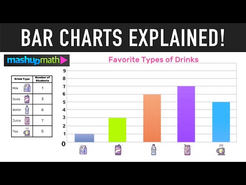
Bar Charts and Bar Graphs Explained
 0:02:47
What is a Bar Chart?
 0:01:55
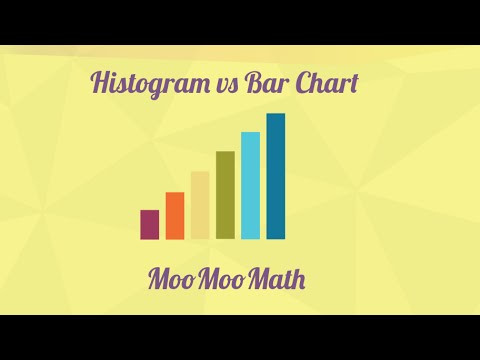
How a histogram is different than a bar chart?
 0:05:23
Types of Bar Charts:Simple, Multiple and Component Bar Charts #barchart #bargraph #datavisualization
 0:04:17
What is a Bar Chart? The Different Types of Bar Charts Explained
 0:04:11
Bar Graphs for Kids (Grade 1 and Grade 2) - Learn How to Read and Interpret Bar Graphs.
 0:03:20
Creating Bar Graphs
 0:01:00
Types of Bar Graphs #barchart #datarepresentation #datavisualization #bargraph #columncharts
 0:00:30
Maths Portfolio On ✨Population of Manipur✨. About ✨2D ,3D bar graph,pie chart,line graph✨etc.✨✨...
 0:10:03
Bar Graphs For Kids | Math | Grade 4 & 5 | Tutway
 0:05:20
Drawing a bar graph from the given data - 4th grade math
 0:07:35
Bar Charts, Pie Charts, Histograms, Stemplots, Timeplots (1.2)
 0:01:01
Don't Create Boring🥱 Charts‼️Instead Use Amazing Charts #exceltips #excel #shorts #exceltricks...
 0:00:18
Draw a Multiple Bar Diagram in Excel
 0:04:00
Bar Graphs for 2nd Grade Kids - Create your own Bar Graph
 0:18:26
IELTS Writing Task 1: How to Describe a Bar Chart
 0:02:28
Making a Bar Chart
 0:11:51
Bar Charts
 0:03:20
How to Make a Bar Graph in Excel
 0:10:04
IELTS Task 1 Bar Graphs Vocabulary and Strategy
 0:00:20
Easy SAT Math Question - Bar Graphs✨
 0:06:37
What is a bar chart? | Daphne Draws Data explains graphs for kids
 0:00:11
Add data to chart in excel #exceltips #exceltutorials #charts
 0:00:15
Easy Way To Create And Add Data To Graph
Комментарии