filmov
tv
Change Background Image for screen size using CSS and tailwind CSS | Coder Shubham

Показать описание
<!DOCTYPE html>
<html lang="en">
<head>
<meta charset="UTF-8">
<meta name="viewport" content="width=device-width, initial-scale=1.0">
<title>Change Background on Screen Size Change</title>
</head>
<body>
<style>
*{
margin: 0;
}
#img{
margin: 25vh auto;
border-radius: 50px;
width: 80vw;
height: 50vh;
background-size: cover;
}
/* Main Code here */
/* You can change these parameters as per your need and if you want to do the same thing in tailwind css then youcan use media classes there like: xl:bg-[url('url')] */
@media screen and (max-width: 768px){
#img{
}
}
@media screen and (max-width: 480px){
#img{
}
}
</style>
<div id="img"></div>
</body>
</html>
Open find and replace and replace
< with smaller than symbol and
> with greater than symbol
 0:01:14
How To Change Desktop Background image in Windows 10 - Tutorial - Quick Tech Tips 2023
 0:00:19
Set a different picture as the background of each monitor #techtips #windows11 #windows10
 0:00:23
How to set Any Picture - Image As Desktop Background | set Image As Windows 11 Wallpaper
 0:00:30
How to Expand Background in Photoshop
 0:13:59
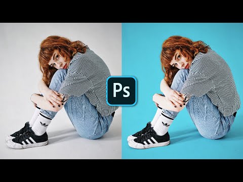
How To Change a Background in Photoshop
 0:00:17
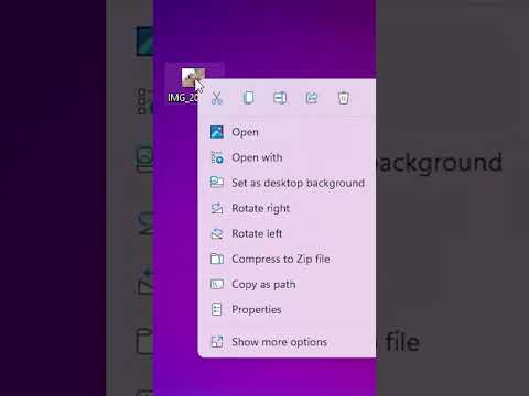
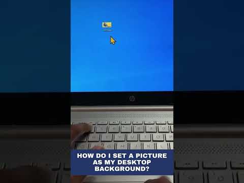
How do I set a picture as my desktop background?
 0:00:23
How to: Change your background in Google Meet
 0:00:53
How to add background image in HTML and CSS | Coding Ninja
 1:05:30
Sıfırdan Web Sitesi Kodlama! (Figma → HTML/CSS/JS)
 0:05:43
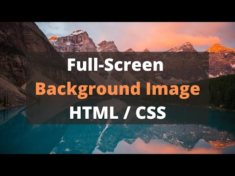
Full Screen Background Image with HTML CSS | Responsive Full Page Background Image CSS
 0:00:38
How to Remove Background from Image in Canva in Mobile Phone#design #logo #editing #graphicdesign
 0:00:13
How to change Desktop Wallpaper 🌆
 0:00:15
Natural background change photo editing ll picsArt background change edit #photo #backgroundedit
 0:01:29
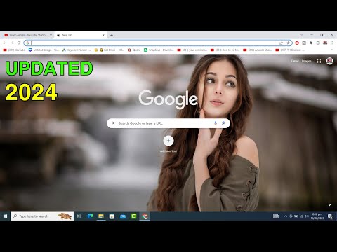
How To Change Google Background Image | Change Chrome Theme & Color (Simple Way)
 0:00:17
How to remove the background of an image in PowerPoint
 0:03:10
How to change your background in Microsoft Teams, a demo tutorial
 0:00:25
PicsArt sa png ka background change kare 😱 new trick 😱 #youtubeshorts #shortsviral #viralshort
 0:01:00
How to Remove Photo Background FREE
 0:00:11
Lock screen wallpaper set shortcut key #laptop #short #lockscreen #wallpaper
 0:00:15
background change photo editing ll girl editing photo ll PicsArt photo editing #edit #shorts
 0:00:09
how to set desktop background windows 11
 0:01:16
Set Background Image (Flutter Screen Background)
 0:00:47
How to Change Background Color in Photoshop - 1 Minute Tutorial
 0:00:28
How to Change the Background Color of a Slide in Microsoft PowerPoint?
Комментарии