I like this learning experience because the videos are short but very impactful!
AMurphySharp
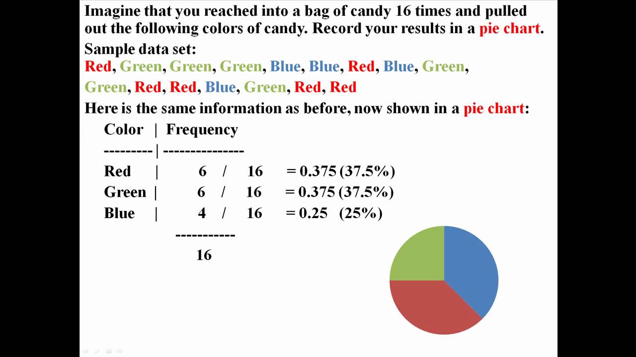
on minuite 1.41 the data representing green and blue are the wrong way round. as 25% is a quarter and the blue is representing it when it should be green and 37.5% is over a quarter so therfore should be represented by blue and not green.
pamelaharris
My teacher expected us to teach ourselves about graphs and these video really helped thank you so much!
matthew
Excel handles the spacing automatically. It can be adjusted, if you prefer something other than the default.