filmov
tv
HOW TO CREATE A RESPONSIVE 8pt GRID SYSTEM ( STEP BY STEP GUIDE)

Показать описание
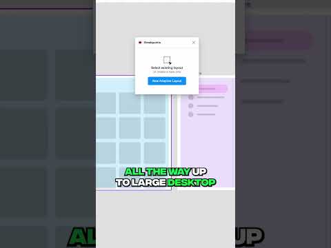
In this video I will show you how to create a responsive 8pt grid system for your web, tablet and mobile ui design.
I will explain to you the reason behind the usage of an 8pt grid system and show you the design where I applied it.
responsive layout grid
-----------------------------------------------------------------------------------------------------------------------
-----------------------------------------------------------------------------------------------------------------------
Want to learn more, connect with me on all socials:
-----------------------------------------------------------------------------------------------------------------------
-----------------------------------------------------------------------------------------------------------------------
#UIDesign #FigmaTutorial #30DaysUIDesign #DesignSkills #UIUXBeginner #salesdashboarddesign #uidesigntutorial #figma #youtube #UserInterface #ui/ux #figmadesigntutorialsforbeginners #uxdesigner
12-column grid 1920x1080 12 column grid for 1440 best grid for mobile design 12 column grid figma
 0:23:13
A practical guide to responsive web design
 0:15:54
5 simple tips to making responsive layouts the easy way
 0:09:44
Master Media Queries And Responsive CSS Web Design Like a Chameleon!
 0:21:17
17: How to Make a Website Responsive | Learn HTML and CSS | Full Course For Beginners
 0:15:13
How To Create a Responsive Navbar Using HTML & CSS | Step By Step Tutorial
 0:15:21
How to create a Responsive Navigation Bar (for beginners)
 0:06:14
Create Responsive CSS Grid Layouts with GRID WRAPPING
 0:11:04
How to create RESPONSIVE Layouts with CSS GRID
 0:54:22
Create a Responsive Portfolio Website Using Only HTML & CSS
 0:20:19
24 | MAKE A WEBSITE RESPONSIVE FOR ALL DEVICES | 2023 | Learn HTML and CSS Full Course for Beginners
 0:08:18
How To Make Website Responsive Using CSS Media Queries | Responsive Web Design Tutorial
 0:00:16
Critical Responsive Layout Tips
 0:00:58
5 Responsive Layouts in 60 seconds
 0:27:19
How to create a responsive HTML table
 0:13:46
Create Responsive Website Designs | Figma Tutorial
 0:41:22
How To Create Responsive Website Using HTML CSS And JavaScript Step By Step Tutorial
 0:00:25
Figma Plugin For Responsive designs
 1:25:35
🌐 Responsive Web Development: Building Websites for All Devices! 📱💻🖥️
 2:02:22
Build a Responsive Website | HTML, CSS Grid, Flexbox & More
 0:08:00
How to Create Responsive Navigation Bar using HTML and CSS
 0:24:01
Building Responsive UI Components in Figma
 0:19:16
How To Make Responsive Website Design Using HTML And CSS Step By Step
 0:00:25
Responsive Templates in FlutterFlow 😎
 0:16:52
How to Create Responsive Navbar using HTML & CSS
Комментарии