filmov
tv
Data Handling - Maths Class 8th - Ex 5.1 - Q1 to Q5 - Chapter 5 - NCERT - CBSE

Показать описание
Data Handling - Maths Class 8th - EXERCISE 5.1 - Q1 to Q5 - Chapter 5 - NCERT - CBSE
Full Exercise on Data Handling, fully solved. This is a video tutorial for 8th class NCERT CBSE students. For other educational stuff, subscribe and press bell icon.
Looking for Information: In your day-to-day life, you might have come across information, such as:
(a) Runs made by a batsman in the last 10 test matches.
(b) Number of wickets taken by a bowler in the last 10 ODIs.
(c) Marks scored by the students of your class in the Mathematics unit test.
(d) Number of story books read by each of your friends etc.
The information collected in all such cases is called data. Data is usually collected in the context of a situation that we want to study. For example, a teacher may like to know the average height of students in her class. To find this, she will write the heights of all the students in her class, organise the data in a systematic manner and then interpret it accordingly. Sometimes, data is represented graphically to give a clear idea of what it represents. Do you remember the different types of graphs which we have learnt in earlier classes?
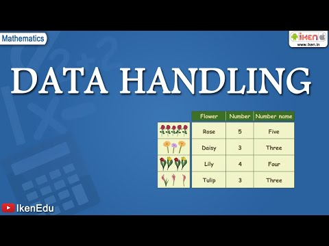
1. A Pictograph: Pictorial representation of data using symbols.
2. A bar graph:A display of information using bars of uniform width, their heights being proportional to the respective values.
3. Double Bar Graph:A bar graph showing two sets of data simultaneously. It is useful for the comparison of the data.
The number of tallies before each subject gives the number of students who like that particular subject. This is known as the frequency of that subject. Frequency gives the number of times that a particular entry occurs. The table made is known as frequency distribution table as it gives the number of times an entry occurs.
Grouping Data: The data regarding choice of subjects showed the occurrence of each of the entries several times. For example, Art is liked by 7 students, Mathematics is liked by 5 students and so on (Table 5.1). This information can be displayed graphically using a pictograph or a bargraph. Sometimes, however, we have to deal with a large data. For example, consider the following marks (out of 50) obtained in Mathematics by 60 students of Class VIII:
Bars with a difference: Let us again consider the grouped frequency distribution of the marks obtained by 60 students in Mathematics test. The height of the bars show the frequency of the class-interval. Also, there is no gap between the bars as there is no gap between the class-intervals. The graphical representation of data in this manner is called a histogram.
EXERCISE 5.1
1. For which of these would you use a histogram to show the data?
(a) The number of letters for different areas in a postman’s bag.
(b) The height of competitors in an athletics meet.
(c) The number of cassettes produced by 5 companies.
(d) The number of passengers boarding trains from 7:00 a.m. to 7:00 p.m. at a station. Give reasons for each.
2. The shoppers who come to a departmental store are marked as: man (M), woman (W), boy (B) or girl (G). The following list gives the shoppers who came during the first hour in the morning: W W W G B W W M G G M M W W W W G B M W B G G M W W M M W W W M W B W G M W W W W G W M M W W M W G W M G W M M B G G W. Make a frequency distribution table using tally marks. Draw a bar graph to illustrate it.
3. The weekly wages (in Rs) of 30 workers in a factory are. 830, 835, 890, 810, 835, 836, 869, 845, 898, 890, 820, 860, 832, 833, 855, 845, 804, 808, 812, 840, 885, 835, 835, 836, 878, 840, 868, 890, 806, 840. Using tally marks make a frequency table with intervals as 800–810, 810–820 and so on.
4. Draw a histogram for the frequency table made for the data in Question 3, and answer the following questions.
(i) Which group has the maximum number of workers?
(ii) How many workers earn Rs 850 and more?
(iii) How many workers earn less than Rs 850?
5. The number of hours for whichstudents of a particular classwatched television during holidays is shown throughthe given graph. Answer the following.
(i) For how many hours did the maximum number of students watch TV?
(ii) How many students watched TV for less than 4 hours?
(iii) How many students spent more than 5 hours in watching TV?
#Class8 #DataHandling #NCERT #NcertSolutions #solvedexercises #teaching #CBSE #maths #MathematicsClass8th #histograms #samrules #bargraph
Make sure to Subscribe and get the latest tutorials for your delight :)
Make sure to check out our other Video Tutorials!
Also, check us out when we're posting other helpful videos all throughout the week to help you tell more and grow more using online video.
 0:03:00
 0:04:15
 0:08:39
 0:22:48
 0:07:05
 0:07:06
 0:03:20
 0:10:24
 0:10:10
 1:41:19
 0:37:20
 0:00:23
 0:13:44
 0:07:39
 0:22:21
 0:08:35
 0:13:21
 0:05:29
 0:11:51
 0:13:10
 0:14:37
 0:34:05
 1:59:54
 0:15:17