filmov
tv
Basic plotting and data visualization with Pandas

Показать описание
In this video we show basic plotting and data visualization in Python's pandas using the .plot() method on the Series and DataFrame. We create a histogram and a horizontal bar chart while further exploring our space missions dataset (see link below). Some useful options are shown for the plot method to make your plots more presentable.
 0:07:09
Science of Data Visualization | Bar, scatter plot, line, histograms, pie, box plots, bubble chart
 0:11:02
Data Visualization in 2024 | The Ultimate Guide
 0:27:21
Data Visualization Tutorial For Beginners | Big Data Analytics Tutorial | Simplilearn
 0:25:57
Data Visualization Crash Course | Consulting Best Practices
 0:26:51
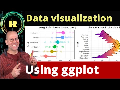
ggplot for plots and graphs. An introduction to data visualization using R programming
 0:18:11
Visualize your data using ggplot. R programming is the best platform for creating plots and graphs.
 0:02:20
D3.js in 100 Seconds
 0:15:03
7 Python Data Visualization Libraries in 15 minutes
 0:22:29
Histogram Chart | Plotting with Pyplot | Data Visualization Class 12 IP | Matplotlib Python
 0:22:01
Intro to Data Analysis / Visualization with Python, Matplotlib and Pandas | Matplotlib Tutorial
 0:05:13
How To Choose The Right Graph (Types of Graphs and When To Use Them)
 0:36:16
Data visualization with R in 36 minutes
 0:29:21
Introduction to Dash Plotly - Data Visualization in Python
 0:06:43
Learn Matplotlib in 6 minutes | Matplotlib Python Tutorial
 0:12:28
Data Visualization using Python on Jupyter Notebook
 0:16:50
Creating Visualizations using Pandas Library | Python Pandas Tutorials
 0:11:28
INTRODUCTION TO MATPLOTLIB || TYPES OF PLOTS || BASIC TERMINOLOGY OF CHARTS
 0:47:14
Data Visualization | Data Visualization Python | Intellipaat
 0:32:33
Intro to Data Visualization in Python with Matplotlib! (line graph, bar chart, title, labels, size)
 0:25:55
Tutorial 8- Matplotlib (Simple Visualization Library)
 0:29:17
Learn to plot Data Using R and GGplot2: Import, manipulate , graph and customize the plot, graph
 1:31:41
Matplotlib Crash Course
 0:09:03
Pandas Plot() Function | Data Visualization | GeeksforGeeks School
 1:10:23
Excel Data Visualization Course – Guide to Charts & Dashboards
Комментарии