filmov
tv
violin plot in seaborn | Nepali | Data scientist | Machine Learning | Statistics

Показать описание
Transcription:
0:00 Short description about Seaborn
1:26 Content
2:05 What is violin plot.
5:24 How to read violin plot.
8:44 Setup libraries and Dataset form GitHub
11:16 Code to use violin plot.
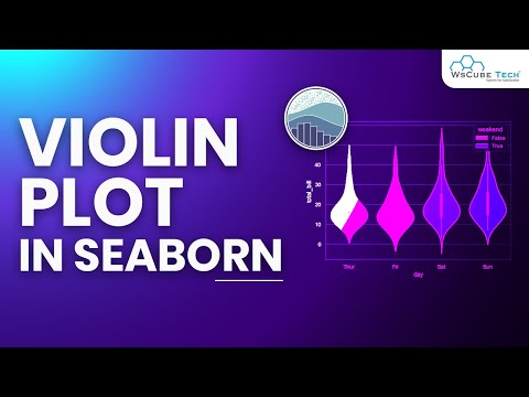
Seaborn is a popular data visualization library that provides a high-level interface for creating informative and attractive statistical graphics in Python. We will use Seaborn's built-in dataset and demonstrate how to customize the violin plot to visualize the distribution of data and compare multiple groups.
Throughout the video, we will cover the basics of violin plots and their anatomy, how to create and customize violin plots using Seaborn, and best practices for interpreting and presenting the information conveyed by a violin plot. Whether you are a data analyst or a data scientist, this video will equip you with the knowledge and skills to create and use violin plots effectively in your own projects.
So, join us in this tutorial to learn how to create and interpret violin plots with Seaborn!
Contact with me
1. Instagram:
2. Check out the YouTube channel:
3. LinkedIn:
4. Facebook:
5. GitHub:
6. Kaggle
#violin
#violinplot
#violinplotinseaborn
#violinplotforbiggner
#violinplotinnepali
#listcomprehension
#artificialintelligence
#deeplearning
#listinhindi
#listcomprehensioninhindi
#pythonlist
#pythonlistcomprehesion
#blockchains
#datascience
#datascientist
#violinplotinhindi
#naivebayes
#MLalgorithm
#mlengineering
#machinelearning
#artificialintelligence
#deeplearning
#blockchains
#iot
#hacking
#hacker
#naiveBayesClassifierAlgorithminHindi
#naiveBayesClassifierAlgorithm
#blackhathacker
#whitehathacker
#pythonlanguage
#sklearn
#pandas
#numpy
#seaborn
0:00 Short description about Seaborn
1:26 Content
2:05 What is violin plot.
5:24 How to read violin plot.
8:44 Setup libraries and Dataset form GitHub
11:16 Code to use violin plot.
Seaborn is a popular data visualization library that provides a high-level interface for creating informative and attractive statistical graphics in Python. We will use Seaborn's built-in dataset and demonstrate how to customize the violin plot to visualize the distribution of data and compare multiple groups.
Throughout the video, we will cover the basics of violin plots and their anatomy, how to create and customize violin plots using Seaborn, and best practices for interpreting and presenting the information conveyed by a violin plot. Whether you are a data analyst or a data scientist, this video will equip you with the knowledge and skills to create and use violin plots effectively in your own projects.
So, join us in this tutorial to learn how to create and interpret violin plots with Seaborn!
Contact with me
1. Instagram:
2. Check out the YouTube channel:
3. LinkedIn:
4. Facebook:
5. GitHub:
6. Kaggle
#violin
#violinplot
#violinplotinseaborn
#violinplotforbiggner
#violinplotinnepali
#listcomprehension
#artificialintelligence
#deeplearning
#listinhindi
#listcomprehensioninhindi
#pythonlist
#pythonlistcomprehesion
#blockchains
#datascience
#datascientist
#violinplotinhindi
#naivebayes
#MLalgorithm
#mlengineering
#machinelearning
#artificialintelligence
#deeplearning
#blockchains
#iot
#hacking
#hacker
#naiveBayesClassifierAlgorithminHindi
#naiveBayesClassifierAlgorithm
#blackhathacker
#whitehathacker
#pythonlanguage
#sklearn
#pandas
#numpy
#seaborn
 0:03:45
 0:11:04
 0:09:24
 0:11:53
 0:06:29
 0:04:58
 0:12:31
 0:10:51
 0:06:36
 0:04:16
 0:10:44
 0:11:38
 0:11:03
 0:10:54
 0:01:06
 0:09:12
 0:21:20
 0:01:02
 0:02:53
 0:10:51
 0:16:51
 0:03:24
 0:03:19
 0:00:51