filmov
tv
How to Make Line Chart Race Video | Tutorial

Показать описание
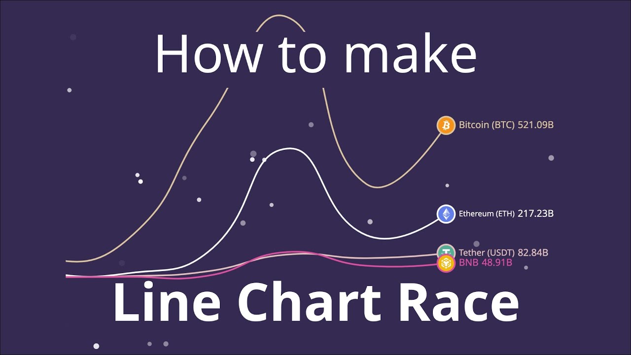
At first we can click on the "Statistics" button located on the top navigation bar, select the cryptocurrencies data set and select some currencies, then press on the “create project” button. Here we can write a title, it will appear at the top of the project.
Select an orientation.
Now, choose "Line chart race" as the type and click on the “create” button.
As easy as that, a chart is created, now we can look at the "Data" page and see that the values are automatically filled. Here we can change the colors of the chart lines.
We can use the Layers page to customize the look of the project on the left side of the screen.
Select the "Line chart race" layer and from the “value” section, change the ‘’Value type”.
Let's play also with other settings, from the "Style" section we can change "Line Stroke Width" and "Figur".
From the “zoom” section turn on “Vertical Zoom”.
If the items are far away from each other, we can use the “Distance Between Items” field to change it.
Open “preview” section and look at the final result
When you're happy with your project, click on the "Export Video" button located below the project preview. When the export process is complete, click on the "Download" button.
Thank you and don't forget to subscribe.
Комментарии
 0:02:36
 0:02:46
 0:05:25
 0:01:57
 0:02:05
 0:00:36
 0:02:15
 0:10:04
 0:20:18
 0:02:12
 0:05:52
 0:03:20
 0:00:40
 0:13:20
 0:06:12
 0:05:35
 0:08:04
 0:09:04
 0:06:58
 0:03:00
 0:07:28
 0:13:28
 0:05:00
 0:03:18