filmov
tv
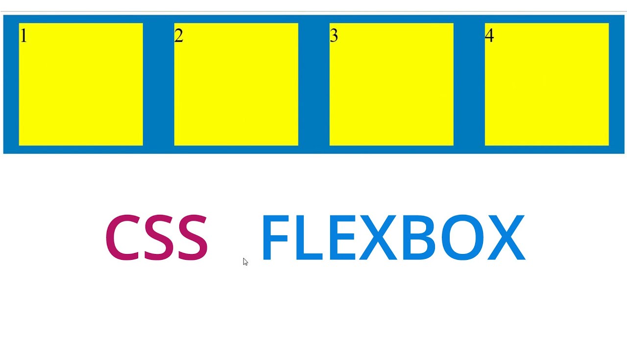
css div box responsive using flexbox | css flexbox tutorial
Показать описание
this video tutorial about , make a responsive css3 grids div container box layout usgin flex box absolute for beginners .
equal with height of div boxs using css and html
use flexbox style :
display : flex
flex-direction : row
justify-content : space-around
flex-flow : wrap
equal with height of div boxs using css and html
use flexbox style :
display : flex
flex-direction : row
justify-content : space-around
flex-flow : wrap
 0:00:24
Learn CSS Flexbox Flex-wrap in 24 Seconds
 0:06:14
Create Responsive CSS Grid Layouts with GRID WRAPPING
 0:00:22
CSS Responsive Layout 🥳 With Flex-wrap & Flex-basis 😱 #responsive #css
 0:00:09
CSS responsive div
 0:20:37
Learn CSS Flexbox in 20 Minutes (Course)
 0:00:11
Responsive CSS grid - Flexbox using HTML & CSS 👨🏼💻🤩 | Your Code School #javascript #yourcodesch...
 0:08:16
Learn Flexbox CSS in 8 minutes
 0:00:22
The only 2 correct ways to center a div #css #frontenddeveloper
 0:00:35
Css Tricks to Create a STUNNING Animated Subscribe Box #coding #frontendcourse #javascript
 0:09:39
5 CSS Tips & Tricks for better Responsive Web Design
 0:00:24
Learn How to Create a Responsive Grid with CSS in 24 Seconds
 0:09:44
Master Media Queries And Responsive CSS Web Design Like a Chameleon!
 0:00:16
make responsive div using media query.#css #html #javascript #webdesign #webdesigner #shorts
 0:00:12
How to center a div in html css | Center a div with CSS
 0:11:04
How to create RESPONSIVE Layouts with CSS GRID
 0:04:38
Learn CSS Positions in 4 minutes
 0:00:14
Responsive layout in html and css || how to create responsive website using html and css #css #html
 0:00:10
Creating Animated Borders for Your Cards with HTML and CSS
 0:00:40
Learn To Fit An Image Inside A Div ! #css #ui #coding
 0:05:02
HTML CSS Fully Responsive Holy Grail Layout || Web Development
 0:03:47
Skewed/Angled Responsive DIV | HTML & CSS
 0:07:47
Responsive Service Box Using CSS Grid Layout
 0:03:07
Responsive Image With Text Section Design Using CSS Grid | Grid Layout | #DeveloperHub
 0:00:05
Responsive Screen Size Breakpoints | Mastering CSS Media Queries for Responsive Web Design | CSS
Комментарии