filmov
tv
Responsive Web Design HTML CSS Tutorial | Flexbox Layout Examples | Responsive Page Layout
Показать описание
Responsive web design HTML CSS tutorial, How to create a responsive website fits any screen sizes | Flexbox Layout Examples | responsive page layout
In this video, I'll show you how to create a responsive flexbox layout page using HTML and CSS. #htmlcsswebsite, #htmlcss2022 , #htmlcssjavascripttutorial, #htmltutorial
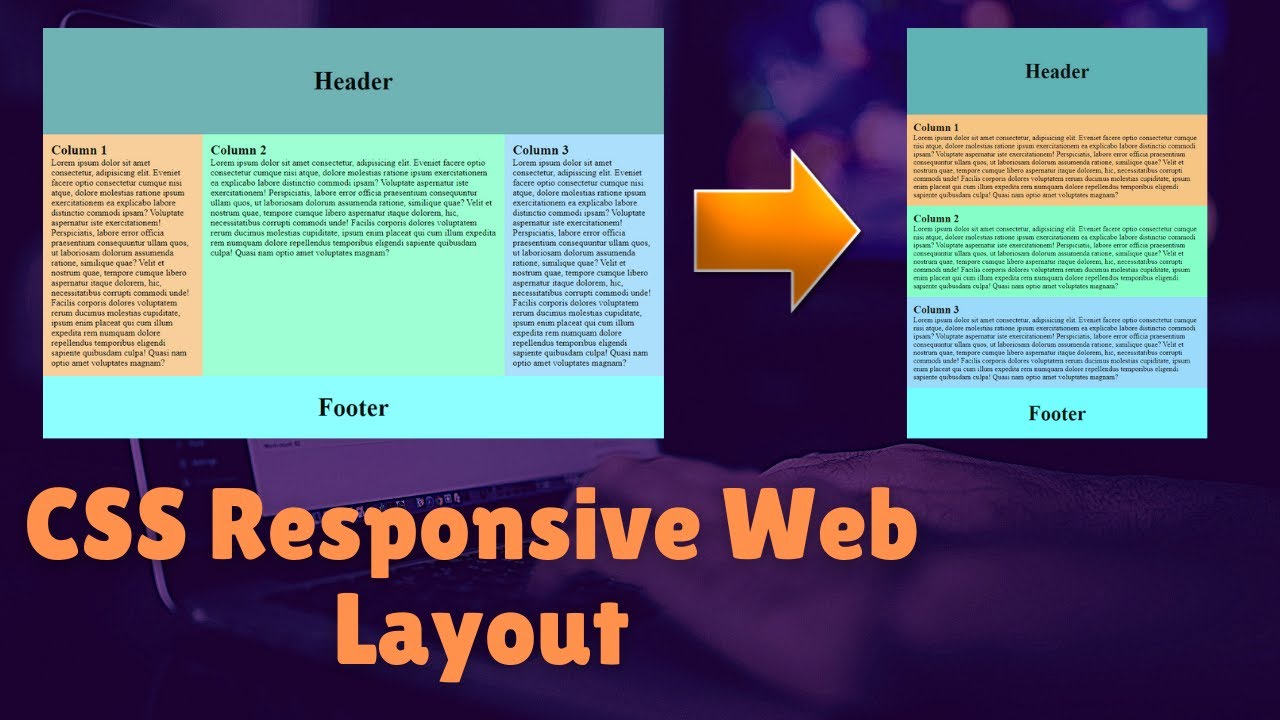
Flexbox is an incredibly useful layout tool that makes it easier for web designers to organize their website content in any way they want, no matter the screen size. There are four main parts of a flexbox: container, row, column, and items. If you've never used flexboxes before, this video will be your guide!
If you're looking for a responsive flexbox layout, then this video tutorial is for you. I'll show you how to create a basic responsive page that uses the CSS Flexible Box Layout Module (or "flexbox").
I'll take you through the process of creating a new HTML document, adding some content and styling it with flexboxes. This way it will work on any device - desktop, laptop, tablet or mobile phone!
How do I create a responsive web design HTML CSS tutorial?
How to scale any website for mobile?
How to fits website any screen sizes?
How to build a responsive website with CSS flex?
How to make a responsive page layout?
How to create a responsive flexbox layout page?
How to build a responsive web design in CSS?
How to make a web page responsive using CSS flexbox?
How to create a CSS web design using flexbox?
Responsive Web Page Layout Video Chapters:
0:00 Mobile Responsive page layout demo.
0:30 HTML code for CSS flexbox page layout.
2:00 3 column CSS Grid layout design.
4:20 How to write CSS code for responsive web page layout?
10:00 CSS media queries for the mobile responsive web page.
-----------------------------------------------------------
- Please have a look at my website for more details!
- Place an order for any Web Development work!
---------------------------------------------------------------
Suggested Videos:
10 Input Types in HTML Every Web Developer Must Know in 2021 | HTML5 Input Types Tutorials
How to Design a Responsive HTML Email Template from Scratch 2021 | Create HTML Newsletter
How to Send Email to Client Using PHP Mail Function | Sending Email in PHP 2021 Tutorial
$_POST | What is the Post Variable in PHP | How to Use Post Variables in PHP 2021
How to Define Variables in PHP | How to Create PHP Variables | (PHP tutorial-3) - 2021
How to Start First PHP Web Project on Local Server/Localhost PHP Tutorial-2
How to Start Web Project with Microsoft Visual Studio 2021 | Visual Studio Project
How to Get Start PHP Hello World Page on Live Web Server | PHP Tutorial - 1
-------------------------------------------------------------------------------------------------
Contact me through social media for web development work:
In this video, I'll show you how to create a responsive flexbox layout page using HTML and CSS. #htmlcsswebsite, #htmlcss2022 , #htmlcssjavascripttutorial, #htmltutorial
Flexbox is an incredibly useful layout tool that makes it easier for web designers to organize their website content in any way they want, no matter the screen size. There are four main parts of a flexbox: container, row, column, and items. If you've never used flexboxes before, this video will be your guide!
If you're looking for a responsive flexbox layout, then this video tutorial is for you. I'll show you how to create a basic responsive page that uses the CSS Flexible Box Layout Module (or "flexbox").
I'll take you through the process of creating a new HTML document, adding some content and styling it with flexboxes. This way it will work on any device - desktop, laptop, tablet or mobile phone!
How do I create a responsive web design HTML CSS tutorial?
How to scale any website for mobile?
How to fits website any screen sizes?
How to build a responsive website with CSS flex?
How to make a responsive page layout?
How to create a responsive flexbox layout page?
How to build a responsive web design in CSS?
How to make a web page responsive using CSS flexbox?
How to create a CSS web design using flexbox?
Responsive Web Page Layout Video Chapters:
0:00 Mobile Responsive page layout demo.
0:30 HTML code for CSS flexbox page layout.
2:00 3 column CSS Grid layout design.
4:20 How to write CSS code for responsive web page layout?
10:00 CSS media queries for the mobile responsive web page.
-----------------------------------------------------------
- Please have a look at my website for more details!
- Place an order for any Web Development work!
---------------------------------------------------------------
Suggested Videos:
10 Input Types in HTML Every Web Developer Must Know in 2021 | HTML5 Input Types Tutorials
How to Design a Responsive HTML Email Template from Scratch 2021 | Create HTML Newsletter
How to Send Email to Client Using PHP Mail Function | Sending Email in PHP 2021 Tutorial
$_POST | What is the Post Variable in PHP | How to Use Post Variables in PHP 2021
How to Define Variables in PHP | How to Create PHP Variables | (PHP tutorial-3) - 2021
How to Start First PHP Web Project on Local Server/Localhost PHP Tutorial-2
How to Start Web Project with Microsoft Visual Studio 2021 | Visual Studio Project
How to Get Start PHP Hello World Page on Live Web Server | PHP Tutorial - 1
-------------------------------------------------------------------------------------------------
Contact me through social media for web development work:
 0:09:39
 4:14:08
 0:21:17
 0:04:18
 0:23:13
 0:38:27
 0:09:44
 0:00:13
 0:00:29
 0:00:23
 0:15:54
 0:49:38
 0:00:15
 0:00:26
 2:02:22
 0:48:12
 0:00:06
 0:00:05
 0:00:12
 0:00:10
 0:00:17
 0:00:24
 0:00:24
 0:00:15